Quantcast
Channel: Figure Review – Tentacle Armada
Viewing all 169 articles
Browse latest View live

Iris Hartley from Lorelei; Sea of Stars (NSFW)

$
0
0
Iris Hartley from Lorelei; Sea of Stars

Another day, another Tony Taka figure. Not long ago, seeing so many Tony figures would’ve prompted a collective sigh of exasperation but these days, the way Alphamax does them, I’m very happy to see them. We looked at Velvet a few weeks ago and today, we’ll be looking at Iris Hartley. Iris is grouped under the Skytube label, which means that she has some significant differences from Velvet, particularly in ero content, which I’m sure will make some collectors happy.

Iris is putatively from Lorelei; Sea of Stars; however, it appears she is also from a 2D shooter game called Valhellio, which was released a couple years ago on Windows. I’m not sure what the relationship between the two titles is. Iris has her own character page which indicates her height is 165 centimeters, her age is 5 years, and that she is not particularly emotional.

Iris is sculpted in 1/6 scale, and I was surprised by how large she is since for some reason or another I was thinking she’d be 1/7 scale. In terms of body build, she looks larger than Kotobukiya’s 1/6 scale Daisy, though not by a drastic amount. She’s about 17 centimeters tall to the top of her head and 20 centimeters tall including the mechanical rabbit ears or horns or antennae that are sprouting from the top of her head. Those ears aren’t removable but almost everything else is. She comes with a very large blue plastic base which she obviously doesn’t need to remain upright.

As usual with a Tony figure, the face is a good place to start, as criticism and appreciation of his artwork tends to center around the way he draws faces. Iris is very obviously a Tony figure, with his usual style even more conspicuous here than with Alphamax’s Fault!! figures, which were done by the same sculptor. Iris is striking a sexy, seductive pose but her face shows vague anxiety, or perhaps shyness. The artwork that this figure is based off of seems to convey a different attitude; personally, I like the ambiguity of the figure’s expression better.

Interestingly, the source artwork shows Iris standing in a pool but the figure is sculpted kneeling, with her legs set more widely. It’s a little unusual for a figure maker to deviate from source artwork; usually they try to remain as faithful as possible to the illustration, sometimes to the detriment of the figure. I almost always prefer figures to be standing up but in this case, I think Iris’s pose, with her head cocked and her body strongly tilted to the left, works much better with her kneeling than it would with her standing upright.

The aspect that will be of interest to many collectors is that her clothes come off. Clothing removal is fairly straightforward – her head and arms detach so that her top can be removed, and her bikini bottom has a clasp so that it can slide down one leg. An instruction sheet (in Japanese only, as usual) is supplied to guide the process. Another interesting part of her design is that the armor plates (made of plastic, and fairly flimsy-feeling plastic at that) attach to her sides via magnets; relatively weak magnets, admittedly, but it’s a nice touch and once her arms are re-attached, they help to keep them in place.

Iris is, I guess, some kind of synthetic humanoid, and I presume she doesn’t have much in the way of personality, but one neat thing about her outfit is the gecko print on her top. I remember visiting my relatives in Hawaii when I was a kid and wearing a T-shirt with a gecko logo that looked very much like Iris’s print. Seeing this logo makes me realize how much I miss manapua and Portuguese sausage and chocolate-covered macadamia nuts.

Iris’s oxygen tank also detaches, or rather, it hangs freely, hooked around Iris’s thumb. It also features a gecko print on the back.

Her diving knife can also be removed, but the thigh strap with the knife holder is fixed in place.

Unlike Velvet, Iris can be stripped almost completely naked. She has a very attractive body build, with large breasts, prominent nipples, and a realistic waist and hip width. The sculpt is also very nice; her rib cage is subtly defined, and even her navel is a little more detailed than might be expected.

It’s a little hard to see from the front but Iris does have sculpted genitalia rather than a Barbie crotch, and for those who care about this sort of thing, her anus is also hinted at.

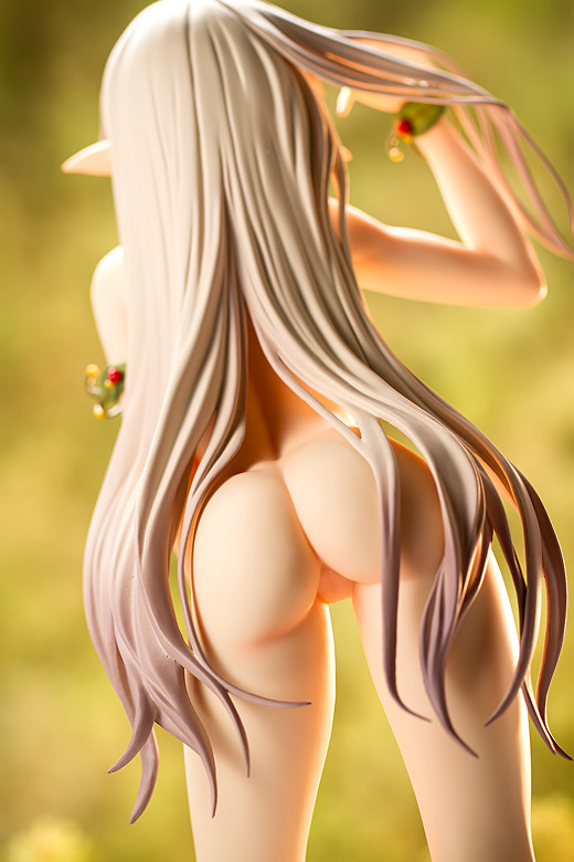
One also wouldn’t be also to see this from the front but one of the sexier elements of Iris’s design is the strong arch of her back. She also has a nice rear, though it’s a little more compact than one might anticipate. Still, it has a nice bubble shape to it, which is not all that common in anime-style character designs.

Alphamax has made a number of really nice figures based on Tony’s work – actually, they’re all fantastic, and Iris is no exception. She’s big, she’s sexy, and she looks great. I’m also very happy that her castoff system isn’t particularly troublesome – I’ve got enough figures now that I disdain fiddly castoff systems – and that she can be displayed in whatever way her owner pleases (I’m displaying her without her clothes but with her oxygen tank). The abundance of Tony figures used to be cause for rolling the eyes; now, I look forward to them, especially Alphamax’s.

For more reviews and nice pictures of Iris, check out Reflective Boundary and Neathgrim.

Incidentally, if anyone noticed that this site was malfunctioning yesterday, that’s because WordPress pushed out an automatic update to version 3.8.2, which broke this site’s permalink structure. I didn’t know about that, so I spent about an hour fiddling with the configuration files and database settings before figuring out what was causing the issue. For some reason, WordPress’s authors refuse to provide a switch to easily disable automatic updates; I love WordPress and think that it is fantastic software but on this issue, the authors are a pack of intransigent wankers.

Iris figure by Alphamax

Ringo Hanamaru from Ane to Boin (NSFW)

$
0
0
Ringo Hanamaru from Ane to Boin

In anime and anime culture, it occasionally happens that some unusual aspect or theme suddenly becomes popular, seemingly all at once. For instance, a couple of anime series centered on futuristic depictions of Oda Nobunaga appeared earlier this year. More broadly, incest has became a strangely persistent and ubiquitous feature of contemporary anime, and I’m at a loss to explain why. Figures are no less immune to this confluence of peculiar themes, and with this particular example, we may observe a tangible specimen of the phenomenon: namely, the toilet bowl seen here. Strangely, girls on toilets have become weirdly visible in figure collecting as of late, with Kaitendoh having released such a figure a few months ago and with Native set to release their own a few months from now. Why is the commode a thing amongst figure makers? Damned if I know. I do know it isn’t the first weird fad we’ve seen, though, and it certainly won’t be the last.

Ringo Hanamaru figure

Ringo Hanamaru is a character from the eroge Ane to Boin. The game was adapted into an anime, localized in the United States as “It’s a Family Affair,” which is an indication of how old it is, as the US hentai anime industry has been dead for years. The game’s protagonist is Keisuke Hanamaru and his ten sisters all lust for his semen. It’s not at all an original premise but I’m told that it is handled reasonably well.

Ringo Hanamaru figure

The game’s artwork was drawn by Toshihide Sano, a well-known artist whose style is easily recognizable. Thus, it is very easy to discern that this figure maintains little of his touch; rather, it takes its cues entirely from the sculptor’s style instead. The sculptor is Katsuhiro Katagiri of the circle Vispo, and his personal hallmarks are just as perceptible. He has sculpted figures for a very long time; his Shiratori Amane figure was one of the earliest figures I bought and one of the earliest reviews I did. He’s also sculpted the two Keumaya Hyper Nurse figures that I’ve reviewed here. It’s a little surprising that his work hasn’t been picked up for mass production by any of the bigger manufacturers; it seems like his figures of Evangelion’s Asuka would be warmly received (of which he showed off a new one just recently).

Ringo Hanamaru figure

As it is, most of his work has been adapted into PVC form by Questioners and Daiki Kougyou, and the latter is responsible for releasing this figure, which they did late last year. It’s actually based on a very old garage kit and it’s a little surprising that they tagged this figure for PVC production, five or six years after the debut of the original model. But then, Daiki Kougyou has always done things their own way and many of the things they’ve done have left me scratching my head in puzzlement (particularly with gangsta lean Saber; we’ll look at her sometime in the future).

Ringo Hanamaru figure

This figure is sculpted in 1/6 scale and stands – or sits – at about 18.5 centimeters in height, including the toilet but not including the big black base that it is bundled with. Ringo comes with removable clothing, the toilet, and a little plastic apple – Ringo means “apple” in Japanese and I’m assuming that’s the main reason it is provided, aside from potentially providing a modicum of discreetness by obscuring her genitals.

Ringo Hanamaru figure

Vispo’s sculpting style is particularly evident in the face, and that’s certainly true here, where Ringo’s sharply sloped eyes and wedge-shaped chin make it obvious who designed this figure. Toshihide Sano’s style is entirely masked; compare Ringo’s design with Orchid Seed’s upcoming Princess Milk figure, which is also based off of Sano’s work and is much more faithful, and the stylistic differences are apparent.

Ringo Hanamaru figure

Looking through the images from the game, Ringo seems to effect an earnest and enthusiastic persona. I’m not sure those are the terms one would use to describe this figure, though; her narrowed eyes are almost certainly meant to give her a seductive aura but they also make her look rather sleepy. Her protruding tongue is likely intended to enhance the effect but personally, I think it looks hilarious.

Ringo Hanamaru figure

This figure gives Ringo a most impressive rack, as does her original game design. However, while Sano seems to like drawing very large breasts, his work often provides them with a sense of weight. The figure gives them a perkier look, with the nipples pointed slightly upwards. It’s reminiscent of Vispo’s work with Hyper Nurse Yuno, who was sculpted after Ringo.

Ringo Hanamaru figure

Ringo’s clothing comprises a vest and a pair of panties. Removing them entails disassembling the figure, and though no instruction sheet is provided, the method is fairly typical; her head comes off and her arms detach below the bicep bands. Pulling her head off was rather difficult, requiring an inordinate amount of force, but it does come off. I found that it was difficult to get her right arm pushed in all the way, which doesn’t bug me too much when observing the figure but is bothersome when taking photographs.

Ringo Hanamaru figure

More annoying is the fact that both her clothing and hair can transfer paint to her body – a substantial amount of paint, in fact. I removed much of it with rubbing alcohol but it was very much a pain to do so and the usage of alcohol always threatens to damage the figure. Fortunately her hair conceals much of the problem but if this were otherwise one of my favorite figures, I’d be livid. As it is, I am considerably annoyed. I’d recommend getting this figure into the display configuration that one wants and never disassembling her again.

Ringo Hanamaru figure

Ringo’s pose is obviously highly sexual, happily showing off everything. It’s similar to Rika Shiraki’s pose except Ringo has some indentations in her thighs which considerably reduce her attractiveness when displayed without the toilet.

Ringo Hanamaru figure

The toilet is made of plastic and features a hinged lid, but the seat does not lift up. Unsurprisingly, the toilet doesn’t feature a drain so I guess it’s technically more of a chamber pot. It also looks very small, too small for a woman of Ringo’s size.

Ringo Hanamaru figure

It fits a 1/8 scale figure reasonably well, though.

Ringo Hanamaru figure

The throne is not a seat where one can rest at ease and if Ringo isn’t placed correctly, she tends to look rather odd. She sits a little better with the base in place but it’s so large that I don’t plan to use it.

Ringo Hanamaru figure

Another odd thing is that while the promo photos of this figure showed her with greenish-black hair, the actual figure has more of a greenish-blue color of hair. This also happened with Kaitendoh’s ER Nurse Miyuu figure from a while back, which had lighter-colored hair than was originally shown.

Ringo Hanamaru figure

Of course, everyone wants to see the details.

Ringo Hanamaru figure

Though if one looks too close, her crotch looks, well, a little rough. She looks fine from the front, though.

Ringo Hanamaru figure

I bought this figure in large part because I thought it is hilarious, and I still think that way. The toilet is such a weird thing to see, especially with a figure like this, which is blatantly sexualized. One doesn’t typically think of the commode as being all that sexy but I think that makes this figure (and Native’s upcoming figure) all the more funny. While I’m a big fan of Vispo’s style, Ringo’s sleepy and slutty expression is, in my view, less salacious and more uproarious, but I like it all the same. What I don’t like is all the scraped paint, which is inexcusable. Overall, this is a pretty neat figure, though one that I imagine would appeal only to a limited subset of figure collectors.

Ringo Hanamaru figure

Kouko Kaga from Golden Time (PS Vita Version)

$
0
0
Kouko Kaga from Golden Time

Kouko Kaga is the lead female character of the light novel and anime series Golden Time. The show seems to have done reasonably well, having received a full 24-episode run along with the usual array of merchandise – posters, telephone cases, keychains, and so on – that accompany a popular series. However, it has yet to draw attention from figure companies, which is too bad, since the characters are both memorable and attractive. This particular figure of Kouko was not sold by itself; rather, it was a pack-in with the limited edition version of the PS Vita game Golden Time: Vivid Memories. That means that expectations need to be tempered, as such throw-in products are rarely as good as a figure that is sold by itself. However, it is to date the only figure of any Golden Time character, at least as far as I know, and I’m not aware of any upcoming figures depicting any members of the show’s cast. Again, that’s too bad, but I suppose one figure is better than none.

Kouko Kaga figure

First, a bit about the character and the show (which, presumably, follows the books reasonably faithfully). Golden Time stars Kouko Kaga and Tada Banri, who are both first-year law students at a Tokyo university. Kouko is wealthy and beautiful, commanding attention from everyone in her presence. However, her outspoken and confrontational nature conceal a neurotic and wildly insecure persona. She is in turn warm and thoughtless and loving and vicious, and at times she serves almost as an antagonist. She is an interesting character, a young woman who doesn’t quite fit into any one of the conventional, commonly-seen female anime archetypes.

Kouko Kaga figure

Unfortunately, those same qualities also make Golden Time hard to watch at times. I got through the first five or six episodes before getting tired of both Kouko’s tempestuous tendencies and the random melodrama, which the show delights in serving up. It doesn’t help that the lead male character, Banri Tada, is prone to his own random outbursts of moodiness. It also doesn’t help that he’s afflicted with amnesia, which is one of the lamest plot devices in any entertainment medium. It’s too bad because I enjoyed the first episode, which showed Banri’s first day at school; it reminded me a lot of my own college experience, which was the most formative time of my life and also the period of my life that I look back on most fondly. The awkwardness of club recruiting particularly brought back some cringe-inducing memories. Maybe the show gets better. I kinda doubt it, though.

Kouko Kaga figure

Regardless of my mixed feelings regarding the show’s characterization and plot development, I do really like the show’s character designs, particularly Kouko’s, which is why I bought this figure. I don’t expect to ever play the game, as I’m not a big huge fan of portable systems and don’t intend to buy a PS Vita (I have a PSP somewhere here, but I really only bought it to play Pangya Fantasy Golf).

Kouko Kaga figure

Kouko is sculpted in 1/8 scale and stands about 20 centimeters in height to the top of her head, and 21.5 centimeters tall overall, excluding the base. She comes ready for display right out of the box; however, I had a hard time getting her feet aligned with the base pegs; she tends to lean forward when they are inserted all the way, and I thought that looked fairly dumb, so I only pushed her feet in partway. I’m not sure if that’s a quality control error or an intentional design choice.

Kouko Kaga figure

I dislike talking about manufacturing quality but being that Kouko is a cheap figure – the price difference between the standard game box and the limited edition is about 3,600 yen – that seems like the proper place to start. Kouko’s technical quality is somewhere between bad and mediocre, and I suppose it depends on how one is observing the figure. Up close, or looking through a magnifying glass or macro lens, Kouko’s flaws are apparent; she has huge seamlines running up her legs, her skin is pitted in places, and her paint job is conspicuously rough.

Kouko Kaga figure

However, from a normal viewing angle it’s difficult to discern those issues. Part of the reason for that is that Kouko is rather small; despite having a more-or-less adult body build in the anime, she looks quite young here, with a large head and a very slender physique. She’s noticeably smaller than almost every other 1/8 scale figure, which makes her technical flaws less obvious.

Kouko Kaga figure

One other aspect in which she differs from almost every other figure is her skin tone; she has a very ruddy complexion, which looks very unusual when she’s placed on display with other figures. I like it, though; I think it gives her a healthier, more vibrant look, though it also makes it so that other figures look a little jaundiced in comparison.

Kouko Kaga figure

This figure is based on artwork done by Eiji Komatsu, the illustrator of the original light novels. He’s a well-known artist whose style – like many anime illustrators – tends to be on the fan-servicey side of things, and so it’s not too surprising that Kouko is depicted wearing a very skimpy swimsuit. Her top is typical but her bikini bottom is much more unusual. It seems to consist of two bottoms, one that is apparently more substantial and another that is strikingly immodest. Her inner bikini bottom is cut high on her hips and comprises a thong in the rear, which looks great. Also attractive are the contrasting black and white colors of her swimsuit.

Kouko Kaga figure

Kouko’s pose is also appealing; the anime shows her to be flirty, particularly when pursuing her destined mate, and this figure does a good job of giving Kouko a look that is both sexy and tantalizing.

Kouko Kaga figure

Her rear is also very cute, though any close-up inspection is hindered by the poor workmanship on display.

Kouko Kaga figure

Her hair is just passable; it’s a prominent aspect of her anime character design but it’s not a standout part of this figure. It is, after all, a cheap figure.

Kouko Kaga figure

And that pretty much sums it up; it’s a pack-in that, although failing to impress in technical terms, still looks appealing, at least stylistically. If one can get past the manufacturing flaws – they’re far more disconcerting in photographs than in normal observation – Kouko has a number of things going for her, particularly her saucy pose and revealing attire. And of course, there’s the prospect that there may be no figures of the Golden Time characters from any of the major manufacturers. I’d be mildly surprised if that occurred but then, we’ve seen ostensibly popular series go by without getting much in the way of figures. It would have been great if this figure had been made by one of the bigger figure makers as a standalone piece rather than a game pack-in, but being that there aren’t any other choices if one wants a figure of Kouko Kaga, it will suffice.

Kouko Kaga figure
Kouko Kaga figure
Kouko Kaga figure
Kouko Kaga figure
Kouko Kaga figure
Kouko Kaga figure
Kouko Kaga figure
Kouko Kaga figure

Inia Sestina from Muv-Luv Alternative Total Eclipse (Eishi Strengthening Equipment Version)

$
0
0
Inia Sestina from Muv-Luv Alternative Total Eclipse

Last year, we took a look at Kotobukiya’s figures of Yui Takamura and Cryska Barchenowa. A few months after those figures hit the market, Kotobukiya released a figure of Inia Sestina, which is what we’re looking at here. It appears that Inia closes out the series, which is unfortunate for fans of Tarisa Manandal, Stella Bremer, or Cui Yifei, who seem unlikely to get figures of their own, and I suppose I can also mention the male characters as well, who almost certainly will not ever get figures. It’s a mildly curious situation, as the various Muv-Luv Alternative series have always been accompanied by strong merchandising efforts, but those are just the breaks, I guess.

Inia Sestina figure by Kotobukiya

We’ve looked at a ton of Total Eclipse figures here but just in case anyone needs a recap regarding the source, Total Eclipse is a story spun off of Age’s Muv-Luv series, in which the Earth has come under attack by a bunch of hungry aliens searching for a good meal. The story was initially published in the magazine Tech Gian and later received an anime adaptation which concluded in December 2012 and is undoubtedly how most people became familiar with the series. Following the final episode, the story returned to its visual novel roots, with Age and 5pb publishing a Total Eclipse video game for the Xbox 360 and PlayStation 3 platforms which presumably concludes the storyline.

Inia Sestina figure by Kotobukiya

I recently resumed watching the anime after having dropped it around the eighth or ninth episode, and it didn’t take long for me to remember why I didn’t like it. The amount of talking-head exposition is ludicrous, even for a property spawned from a visual novel, the plot meanders aimlessly (when it does lurch forward, it does so with the grace and subtlety of a sledgehammer), and the characters are almost entirely lacking in depth and charisma. On one hand, none of this should be that surprising, being that it’s reasonable to assume that Total Eclipse mainly exists to sell toys, books, and pillowcases rather than to tell a story. On the other hand, that doesn’t explain why the series received a full 24-episode treatment. That the principal characters are almost relegated to guest-star status early in the show by a bunch of random commie military people is also puzzling. The sci-fi alien invasion trope is a good one, and one has to work pretty hard to screw it up, but somehow the producers of Total Eclipse managed to do it. There’s a good story somewhere in there; they just weren’t competent enough to bring it out.

Inia Sestina figure by Kotobukiya

But the show’s character designs are still good; if it’s hard to botch an alien invasion show, it’s really hard to mess up a design philosophy predicated on vacuum-sealing large-breasted female (and muscular male) characters into skin-tight suits, and that’s a major reason why I keep buying figures of characters from this show (and Evangelion, Space Battleship Yamato, Horizon in the Middle of Nowhere, and so on).

As mentioned, this particular figure is manufactured by Kotobukiya; it’s sculpted in 1/7 scale and stands about 16.5 centimeters in overall height. Inia is basically ready for display right out of the box; she comes with no accessories, not even little plastic rocks like those supplied with Yui.

Inia Sestina figure by Kotobukiya

Inia is the younger half of the pairing called the Scarlet Twins, and a comparison between the two seems like a good place to start. Obviously, Inia is more slightly built than her older counterpart. Her hair is a bit different as well; while Cryska’s hair is a matte purple color, Inia’s hair has an almost satin sheen to it and is slightly lighter in color.

Inia Sestina figure by Kotobukiya

One aspect in which Inia doesn’t greatly differ from Cryska is in the development of her chest; Inia’s bust is a little smaller than Cryska’s but it is still much larger than expected, especially considering that she otherwise has the basic body build of a young girl. Interestingly, Inia’s breasts appear to be about the same size as Meiya Mitsurugi’s, even though she is smaller in all other respects.

Inia Sestina figure by Kotobukiya

Of course, Inia’s breasts are highlighted by the design of her piloting suit. In keeping with anime convention, her outfit is ridiculously tight, showing off every contour of her body. The glossy coloring heightens its appeal as well, along with giving her uniform a futuristic look.

Inia Sestina figure by Kotobukiya

That, of course, includes her navel. I like the little symbol above her pubic region.

Inia Sestina figure by Kotobukiya

And I also like her big clunky shoes, which I think are pretty cute. Her shoes, gloves, pauldrons, and chin guard frame Inia’s body, presenting a bulky, solid, and almost mechanical look that complements her sinusoidal, obviously feminine form.

Inia Sestina figure by Kotobukiya

As with their previous figure of Inia, Kotobukiya has presented her hair as sweeping to the side.

Inia Sestina figure by Kotobukiya

The bases of Yui, Cryska, and Inia can all fit against each other so that they can be displayed together.

Inia Sestina figure by Kotobukiya

Also in keeping with anime convention, Inia’s eyes are large, larger than Cryska’s, giving her a much younger-looking appearance than her sibling, and her eyelids slope upwards from the outside of her face towards the bridge of her nose – this style is called “tareme” and generally denotes a younger person with a gentle, meek, or otherwise diffident and agreeable sort of personality, which seems to be appropriate for Inia. Her wide eyes and parted lips convey a slight sense of anxiety – understandable for a girl who doesn’t really fit into society, even military society, all that well.

Inia Sestina figure by Kotobukiya

I’ve liked all of Kotobukiya’s figures of the Muv-Luv characters in their piloting suits, and Inia is no exception; she looks great. She has a lovely design made sexier by the attractiveness (some might say lewdness) of her outfit. Pretty much the only regret I have is that I paid full price for this figure; virtually every single one of Kotobukiya’s Muv-Luv figures has hit the bargain bin shortly after release. But then, she looks so nice that I don’t mind that much.

Inia Sestina figure by Kotobukiya

Psylocke from the Uncanny X-Force (Fine Art Version)

$
0
0
Psylocke from the Uncanny X-Force

As I’ve remarked before, even though Japanese anime culture has a number of parallels with Western pop culture, they don’t seem to intersect that often. This is particularly and peculiarly evident in manga and comics; despite their similarities (and the influence of American comics on the development of manga), I don’t know too many anime fans who read Western comics, and I’m certain that there are many comic book readers (particularly older ones) who don’t care that much for anime.

Despite this separation, fans on both sides frequently share a passion for collecting things, particularly figures. Figures of characters from Western properties often have some differences compared to anime figures; they are often sculpted in polystone, they are typically on the larger side, and they often come from specialist manufacturers unknown to collectors of anime figures. However, that is not the case with this particular figure; this figure of Psylocke comes from Kotobukiya, a company that every anime figure collector knows. Strangely, this figure is not the first, nor the second, nor even the third, but is the fourth figure of Psylocke that Kotobukiya has released in the last four years. Kotobukiya has made some attempts at integrating the two audiences, particularly with their Bishoujo series, which combines Western comic book and science fiction characters with anime-style design sensibilities, but they also make a number of statues targeted squarely at Western comic book collectors. We don’t often look at such figures here but as Psylocke is my favorite character in all of comic books, for her we will make an exception.

Psylocke Figure Review

Psylocke, whose real name is Elizabeth Braddock, is one of the main members of the X-Men. She made her debut in comics way back in the 1970s, appearing in several minor titles before joining the main cast of the Uncanny X-Men. Originally a British woman, she later had her memories and personality scooped out and shoved into the body of a Japanese woman. In American pop culture, being Japanese generally means you’re either a nerd or a ninja, and since Psylocke already possessed acute mental powers, she got turned into a sexy physical combatant.

When the X-Men franchise was split into two books, she moved to the new, adjectiveless X-Men series. She later moved on again to the series X-Treme X-Men, in which she was killed in its second issue. She stayed dead for a while and for a long time it looked like she wouldn’t be coming back, but after an absence of many years, she was finally resurrected and rejoined the Uncanny X-Men, almost 250 issues after she first became part of that team.

Historically, comics have been stereotyped as being formulaic and lacking in ambiguity (the phrase “comic book plot” has come to be used to derisively described anything that is simplistically-constructed and overly black-and-white). However, straightforward good-versus-evil storylines have fallen out of fashion, and so it is not surprising that Marvel Comics has adjusted its own titles to fit with the times. Accordingly, a new book – titled X-Force (re-using the name of a comic series that appeared back in the 90s) – was spun off from the X-Men franchise. Its members – including Psylocke – comprise a “superhuman black ops” team whose members will “spy, torture, and kill” those who threaten mutantkind (I’m quoting from Marvel’s website). I have to admit that I find that sort of thing to be badly clichéd. This book has gone through several iterations; it was originally titled X-Force, and then they launched a book titled Uncanny X-Force, and now I think it’s just called X-Force again. This sort of saturation is a major emphasis of Marvel’s publishing strategy; in total, there appears to be at least a half dozen X-Men titles currently being published, including “Amazing X-Men,” adjectiveless “X-Men,” and “Wolverine and the X-Men.” The long-running The Uncanny X-Men title was ended at issue #544, concluding a publishing run that spanned nearly half a century, only to be relaunched a few months later as “Uncanny X-Men,” apparently dropping the “the” from the title. It’s extremely confusing. Suffice to say, I don’t really read comic books anymore. Hopefully someday they’ll streamline things.

Psylocke Figure Review

Psylocke is perhaps the X-Men’s most famous action girl (although in the comics I’ve read, she seems to lose a lot of the fights she gets into), and she’s also a very popular subject in visual media and video games. She’s gotten a number of figures, and this is her most recent one. As mentioned, it’s manufactured by Kotobukiya; the sculptor is Erick Sosa, who has previously worked with both Kotobukiya and Yamato. She’s sculpted in 1/6 scale and stands about 26 centimeters in overall height. It’s made of polystone rather than the more familiar PVC used in virtually all anime figures. Like many larger polystone figures, her arms are detachable and she also comes with an extra left arm which features her psychic blade molded in transparent plastic.

Psylocke Figure Review

I have to admit I’m not really a big fan of polystone figures; they are generally extremely fragile, with none of the elasticity of PVC figures. I’ve had numerous PVC figures fall to the floor without the slightest hint of damage; no polystone figure would survive that sort of incident unscathed. Fortunately my copy of Psylocke arrived without any damage.

Psylocke Figure Review

Another concern, quite probably more apparent to other viewers, is that polystone figures are often obviously hand-painted and their quality level tends to leave something to be desired, particularly when compared to a PVC figure from a company like Alter or Max Factory. Paint is often flat in tone, skin tones tend to be brownish, and in the worst cases, imprecision of paint application is glaringly obvious. Those flaws are evident to some extent on this figure; for example, this version of Psylocke shares the same peculiarly-dark skin tone as Sideshow Toys’s Psylocke and Pop Culture Shock’s Kitana; perhaps they share the same factory in China. Her skin tone is very matte, though her outfit shows a shinier satin finish that looks more appealing.

Psylocke Figure Review

Maybe the most obvious flaw visible in these pictures concerns her right eyebrow, which isn’t completely painted, and obviously stands out. In person, though, it’s impossible to see it; the area in question is perhaps a tenth of a millimeter in width, and so I don’t feel compelled to try to touch it up with dark paint, as doubtless I’d botch the job. It does indicate that these sorts of figures tend to be more camera-unfriendly than many anime PVC figures, though.

Psylocke Figure Review

Psylocke is shown here wearing a variation of her most iconic outfit, a sleeveless high-cut leotard with form-fitting thigh-high boots. Normally her leotard colored a deep, brilliant blue with a red sash tied around her waist, but here she’s wearing a black outfit with a gray sash, which I suppose is meant to be more indicative of “black ops” styling. It’s still an attractive look, though; black and gray often work well together in style. I’m not entirely sure if and when she wore this outfit, though; I think the early issues of X-Force had her wearing her usual blue outfit, and then her design was changed so that she wore a rather lame-looking bodysuit. In current comics, she wears a bodysuit slightly reminiscent of Julia Carpenter’s Arachne costume, which is a little less lame but is still disappointing, being that her older outfit is still her best outfit.

Psylocke Figure Review

One thing about her depiction here is that the upper part of her outfit is oddly squared off, like a collared tank swimsuit; in the comics her leotard tapers towards her neck.

Psylocke Figure Review

One hallmark of her former design are the bands that encircle her thighs and upper arms. In Jim Lee’s original design of her Japanese body, she wore a varying number of bands on each leg, which I’m sure confounded every other artist who had to draw her, and eventually the most common interpretation of her design included two bands on each limb, as seen here.

Psylocke Figure Review

In the comics – or at least, in the comics I used to read – Psylocke generally fought hand-to-hand rather than with weapons. However, a lot of standalone art has her holding swords, which isn’t surprising, as a sexy, half-naked fighter girl holding swords typically looks cooler than the same character just standing around bare-handed. And of course, if one is emphasizing the coolness factor, the character needs to be dual-wielding, since two weapons look cooler than one. Psylocke is holding a couple of swords here done up in a Japanese motif, though the blades are straight-edged rather than curved. I’m no expert in medieval Japanese weaponry so I have no idea whether this is a realistic portrayal or not. I have to admit that it reminds me a bit of Leonardo from Teenage Mutant Ninja Turtles, whose swords also lacked a curve, at least in the original cartoon.

Psylocke Figure Review

And I’ll admit that her toes remind me a bit of the ninja turtles as well. She’s wearing tabi-styled thighhighs, which wasn’t a feature of her most iconic costume, but I think it looks both cute and cool. It also gives her outfit a bit of Japanese flair.

She’s standing on a broken pillar, which also looks pretty nice. Just as nice is the fact that it’s quite compact, considering her stance; the more typical circular base would have been huge if they had gone that route.

Psylocke Figure Review

Speaking of her stance, she’s set in an action pose, leaning forwards with legs spread wide. It’s a great look that emphasizes her femininity while conveying her eagerness to get into a fight.

Psylocke Figure Review

A character can’t wear a costume like this without having a good-looking ass and as expected, Psylocke’s ass looks great.

Psylocke Figure Review

The immodesty of her outfit was one of the more divisive aspects of Psylocke’s character design. It’s too bad that Marvel has gone away from this sort of style with both Psylocke and Ms. Marvel (who, as I understand it, is now named Captain Marvel). Fortunately, figure makers seem to prefer this look.

Psylocke Figure Review

Her left arm can be swapped out for an alternate piece, which features her psychic knife, the focused totality of her psychic powers, as the comics were fond of telling us. It doesn’t look too bad, but as I’ve often written, I’m not a big huge fan of special effects sculpted in transparent plastic, and even if I were, I like the symmetry of her two-sword look better.

Psylocke Figure Review

Her eyebrows are sharply slanted, enhancing the aggressiveness of her look. Her eyes aren’t as slanted as some depictions I’ve seen, which I’m grateful for; it seems like many Western comic book artists try to make Japanese characters look Japanese by giving them wildly slanted eyes. Being Japanese-Korean, I’ve always thought that that is weird as hell; my eyes aren’t slanted and I don’t know any Japanese or Korean people whose eyes are slanted like that.

One odd thing about her design is that artists never seemed to really settle on her eye color. Her eyes are sort of bluish-green here; elsewhere, I’ve seen them colored brown, blue, and violet.

Psylocke Figure Review

I really like this figure; Psylocke looks sexy and dangerous, just as she should. Her pose is great and I love her design. I do wonder what would happen if they combined this sort of Western design with their PVC figure manufacturing techniques; personally, I think that would make for a better product. But then, it doesn’t seem like too many people collect both anime PVC and Western comic book-derived polystone statues. It’s neat to see Kotobukiya making products like this and I hope they keep it up.

Psylocke Figure Review

Here’s the newest Kotobukiya Psylocke with the oldest Kotobukiya Psylocke. I have to admit that the Bishoujo figure isn’t one that I regard all that highly these days.

Psylocke Figure Review

And just for kicks, here’s a size (and style) comparison between two 1/6 scale Kotobukiya figures, Psylocke and Daisy.

Psylocke Figure Review

Alleyne from Queen’s Blade (Orchid Seed Version) (NSFW)

$
0
0
Alleyne from Queen's Blade

When figure companies produce products of characters from shows with large casts, it’s typical for them to make figures of most, if not all, of the principal characters. Such a move is logical; after all, figure collectors are, well, collectors. This figure is anomalous, then, as it’s the first and only figure of a Queen’s Blade character that Orchid Seed has ever produced. It seems like an almost random decision for them to make this figure, as it doesn’t resemble much of their past catalog, but then, when a figure looks this nice, I suppose quality is the only explanation that is needed for this figure’s existence.

Alleyne figure

Alleyne is a character from the original Queen’s Blade series. Designed by well-known anime artist Matsuryuu, she is unusual in that while most of the Queen’s Blade characters are defined by their individuality (there can, of course, only be one queen), Alleyne is strongly associated with Nowa, the young half-elf whom she takes into her care. Alleyne serves as a mentor to the younger girl, and from their relationship we see that she is an inveterate teacher, constantly analyzing the performance of her charge (and their foes, when they engage in combat). Despite valuing discipline, Alleyne is also warm and kind.

From what I can tell, Alleyne is a popular character but I don’t remember that she made much of an impact in the Queen’s Blade anime adaptation. She did make a couple of appearances in the show’s bonus OVA series, though, and despite typically being presented as honorable and dignified, Alleyne is no less prone to fan-servicey moments than her castmates. In particular, the OVAs depict her fellating Nyx’s staff and stripping down and doing push-ups in a comically theatrical manner.

Alleyne figure

That sexualized presentation continues with this figure. This figure is produced by Orchid Seed, a company with a long history of making fan-servicey figures. Its size is quite impressive; while most Queen’s Blade figures are 1/8 scale, Alleyne is sculpted in 1/6 scale, towering over most of them. Indeed, she seems even larger than her listed scale, being that she stands about 26.5 centimeters in height despite bending over at the waist.

Alleyne figure

This figure is based off of artwork done not by Matsuryuu but by Tsutomu Miyazawa, who worked on the anime adaptation of Queen’s Blade. The depiction of Alleyne in the illustration doesn’t differ extensively from her original design; however, the figure is quite dissimilar to both. While Alleyne’s design is typical of many female anime characters – large head, relatively small body, and slender limbs – the figure gives her a more robust body build, with a proportionately smaller head, long legs with exceptionally thick thighs, and broad hips.

Alleyne figure

Her cup size has also been drastically revamped; Alleyne had a fairly modest bust, at least by Queen’s Blade standards, but this figure gives her chest a sizeable enlargement. Accentuating their newfound growth is their shape, which gives a slightly more realistic impression of weight.

Alleyne figure

Interestingly, in a move reminiscent of MegaHouse’s old Risty figure, the sculptor has given Alleyne a prominent six-pack of abdominal muscles. That’s definitely an unusual choice, as even fighter girls in anime generally don’t have strongly-pronounced musculature. I like it a lot, though. In fact, I like all of the changes that were made from the source artwork; while Alleyne’s original design is very cute, this figure adaptation is quite a bit more distinctive.

Alleyne figure

Alleyne’s clothing consists of a foliage bikini – a little silly-looking but typical of what she wears in the show. Unsurprisingly, it can be removed. Orchid Seed even provides an English translation for its instruction sheet, which is both appreciated and unfortunately rare (they are, as far as I remember, the only Japanese figure company to do so).

Alleyne figure

Removing her bikini is a straightforward process with one caveat; Orchid Seed used some kind of weak, gummy adhesive to keep her bikini top on. That’s a little annoying since it’s sticky and leaves a residue (which I haven’t yet tried to clean up). Hopefully this gummy stuff won’t cause problems later on (such as when dust and dirt accumulate on the figure). (I should mention that my figure also had some odd marks on it which looked as if they were caused by paint transfer, except they appeared to be too dark to be paint. They cleaned up after some rubbing with a Q-tip and isopropyl alcohol.)

While she does have detailed nipples, Alleyne unfortunately lacks any hint of genitalia; her crotch is as smooth as a Barbie doll’s. Being that Orchid Seed has not had any qualms about making fully explicit figures in the past, I’m guessing that the absence of a vagina is due to Hobby Japan policy. It’s a little puzzling, being that Queen’s Blade often tries to get as close to porn or hentai as it can without crossing the line, but then, I suppose there are several instances in larger entertainment media where one can witness this phenomenon (female-fronted American pop music, for instance).

Alleyne figure

Alleyne’s expression is generally more analogous to the source art than her body physique, with the noticeable exception that she isn’t blushing. It’s kind of an odd expression that isn’t easy to read; without the flushed cheeks, it’s difficult to tell whether Alleyne is embarrassed, disgusted, or angry. Absent any familiarity with Alleyne’s personality, one might assume that she has a tempestuous disposition, which would be quite the incorrect conclusion. Similarly, her pose is a little strange, being that it looks a little like she’s cocking a finger gun at her head, but then, such an unusual pose naturally attracts attention, and her bent right arm also puts the flexed muscles of her biceps on display. At any rate, one could concoct a humorous explanation for the combination of her pose and her annoyed or exasperated countenance.

Alleyne figure

Orchid Seed’s Alleyne is a very lovely figure with an exceptionally impressive sculpt. Her body sculpting is exquisite, from the evident muscles of her stomach, arms, and legs to the detailing of her toenails. The decision to eschew her original appearance for an older, somewhat more realistic design is an admirable one in my estimation. Her unexpectedly large size makes all her good points even better. She’s certainly one of my favorite Orchid Seed figures already. I can only hope that one day they’ll decide to make a figure of Irma that looks this nice.

Alleyne figure
Alleyne figure

This review is, as usual, one of the last ones out of the gate; Alleyne has also been reviewed at Reflective Boundary, Neath Grim, Figyura, and Wieselhead, so go visit those sites for more words and pictures.

Alleyne figure
Alleyne figure
Alleyne figure
Alleyne figure
Alleyne figure
Alleyne figure
Alleyne figure
Alleyne figure
Alleyne figure
Alleyne figure
Alleyne figure
Alleyne figure
Alleyne figure

Tamaki Kousaka from To Heart 2: Dungeon Travelers (Kaitendoh Version)

$
0
0
Tamaki Kousaka from To Heart 2 Dungeon Travelers

Amongst anime hobby companies, Tamaki Kousaka’s popularity as a muse is everlasting. This isn’t always a good thing; the esteem in which she’s held by figure makers occasionally seems excessive, and a large segment of the collecting population greets each release of a new Tamaki figure with a collective rolling of the eyes. However, I pay no attention to that; I like Tamaki, and I own a bunch of her figures. It’s actually been over a year since I reviewed one; in other words, it’s been too long since we’ve looked at her. To remedy this insufficiency, we’ll look at one of her newest figures, which squeezes her into her Dungeon Travelers fighting outfit. We’ve seen this before; Kotobukiya made a figure of her in this outfit, but while that figure exemplified why, for a long time, people generally regarded Kotobukiya as a maker of mediocre figures, this one, by Kaitendoh, is quite a bit nicer.

Tamaki Kousaka figure by Kaitendoh

Kaitendoh has been around for a while, and I actually reviewed their first figure, which also happened to be one of Tamaki Kousaka. In retrospect, it’s a pretty poor figure (and those pictures are pretty awful, too). Strangely, while Kaitendoh hasn’t ever attained much respect in terms of their overall product catalogue, they’ve employed some fairly distinguished sculptors. That first Tamaki figure was sculpted by the same guy who sculpted this much better-received Tamaki by Max Factory, and this Tamaki was sculpted by Ken Yokota, the guy who sculpted Good Smile Company’s Rin Tohsaka. He also sculpted Retia Adolf, which is a good figure but not one that’s likely to get anyone’s testicles quaking in joy. In other words, I had no idea what to expect before receiving this figure, but my expectations were aligned on the pessimistic side.

Tamaki Kousaka figure by Kaitendoh

However, one aspect in which this Tamaki surpassed my expectations is in size. She’s listed as 1/6 scale, so I had hoped she’d be big, but I didn’t think she’d be quite this big. She’s about 28.5 centimeters in height from her base to the top of her head, and about 32 centimeters tall in overall height, including her sword handle. I’ve got several other 1/6 scale figures on my desk – including Daisy, Alleyne, and Iris – and Tamaki is substantially larger than all of them.

This figure is mostly ready for display right out of the box; the only thing to do is to remove some plastic sheeting and put her sword into her hand. One curious element is that this particular figure has no breast-baring castoff option; we’ll talk more about that in a bit.

Tamaki Kousaka figure by Kaitendoh

Tamaki is, of course, one of the main girls from the To Heart franchise. To Heart is one of those peculiar properties that hasn’t gotten a core release – that is, either a visual novel or an anime or manga adaptation – in quite some time, but still remains a mainstay in output of hobby goods. To some extent, this has caused Tamaki’s personality to be subsumed by her visual appearance. Notably, the design of her face tends to vary depending on whether the figure maker wants to present her as a caring, loving older sister or as a lascivious, man-eating sexpot. Here, Tamaki has a friendly look, with big, limpid eyes and a warm smile on her face. It might appear a little odd, clashing as it does with her fighting pose, but there have been so many Tamaki figures with so many different looks that this sort of expression doesn’t seem inappropriate.

Tamaki Kousaka figure by Kaitendoh

While her facial expression is reserved, her outfit certainly is not. She’s dressed up in her samurai costume, which comprises thigh-high boots, matching gloves, war panties, and a top that is clearly inadequate to the task of restraining her breasts. It’s a lovely outfit, one that I like a great deal. Incidentally, this isn’t even the most skimpy outfit worn by the characters of To Heart 2 Dungeon Travellers; that distinction probably goes to Lucy, who is basically nude in one of her costumes.

Tamaki Kousaka figure by Kaitendoh

Tamaki is generally depicted with an assertive bust size but this figure makes them quite large indeed. It’s reminiscent of the older Max Factory figure in that respect, though they’re perhaps just a bit smaller in proportion here.

Tamaki Kousaka figure by Kaitendoh

As mentioned, there’s no explicit castoff feature with this figure. That came as a surprise as I had seen some pictures of this figure appearing topless; apparently the version of this figure in a white-colored outfit featured a torso with bare breasts, but this one does not. That other figure also had a different head, which has an open mouth. I didn’t like it nearly as much as this one, and to be honest, I’m not really that disappointed about the lack of explicitness on this figure, either; I really like how her bikini armor looks and thus wouldn’t want to remove it.

Tamaki Kousaka figure by Kaitendoh

Her hip armor is removable, however. She separates at the waist so that it slides off her hips. Her head is also removable, though there’s no point in doing so with this version of the figure, aside from removing her plastic packaging wrap.

Tamaki Kousaka figure by Kaitendoh

Kaitendoh’s figures tend to fail to impress in terms of manufacturing quality, but I was surprised at how nice Tamaki looks. Her paintwork is clean and precise. The matte look of her bustier and belts give a nice contrast to the glossy sheen of her boots, gloves, and panties.

Tamaki Kousaka figure by Kaitendoh

Her body is also sculpted quite well. In particular, her body has a soft look that is enhanced by the tightness of her costume.

Tamaki Kousaka figure by Kaitendoh

Anyone with a fetish for armpits – I know you all are out there – will be pleased with Tamaki’s pose, which depicts her with her arms raised high. It’s not clear what she’s doing, exactly, but as far as dynamic anime fighting poses go, it looks pretty good, if not entirely practical.

Speaking of practicality, I’m really hoping that leaning isn’t an issue with this figure, being that she’s quite substantial and all that weight is being supported by one leg. Unusually, that one leg fits into her base very loosely; if you happened to turn this figure upside down she’d fall to the floor. Kaitendoh does use a metal rod to support her foot; it slides into a socket in the base, so hopefully the rest of her leg is also reinforced.

Tamaki Kousaka figure by Kaitendoh

As a samurai, Tamaki is equipped with a large katana. It also looks quite nice.

Tamaki Kousaka figure by Kaitendoh

It’s made of plastic, unsurprisingly, but the parts that are supposed to be metal do have a realistic reflective quality; you can see the back edge reflecting Tamaki’s hair here.

Tamaki Kousaka figure by Kaitendoh

I’m really impressed by how nicely Tamaki turned out. She’s huge, which I almost always prefer when it comes to figures, and she’s got a very sexy outfit. I’m even more impressed that Kaitendoh made a figure that looks this great; their earlier figures have kept expectations tempered, but hopefully they can continue to make high-quality figures. There are a lot of Tamaki figures out there, but this one is definitely one of the better ones.

Tamaki Kousaka figure by Kaitendoh

Incidentally, there’s an Orca Toys figure that looks quite similar to this one, with much the same pose and the same outfit. However, she looks quite a bit more aggressive, and I think that one will feature a topless castoff option. I’m not sure whether I will buy that one or not.

Tamaki Kousaka figure by Kaitendoh

Tomo Asama from Horizon in the Middle of Nowhere (Zudon Miko Version)

$
0
0
Tomo Asama from Horizon in the Middle of Nowhere

As we’ve noted before, there aren’t that many figures of characters from Horizon in the Middle of Nowhere, and those that do exist are mostly from relatively minor manufacturers. Fortunately, a couple of exceptions have been recently released: Alter’s Kazuno and Tomo Asama by Kotobukiya. This happiness is tempered by the realization that those two figures may be amongst the last figures from the series to be released (Wave has a Beach Queens Kimi Aoi scheduled to drop next month, and Volks is supposedly doing figures of Kimi and Kazuno, but who knows whether those will ever materialize). A sad state of affairs, that, and it appears that figure companies are moving on to the next big thing, such as Kantai Collection, which somehow feels a bit like it’s worn out its welcome before even having arrived. The only consolation is that if Tomo is the last Horizon figure to be made by a major figure company, she is at least a very fine one indeed.

Tomo Asama figure

This is the third figure of Tomo Asama, following a Beach Queens figure and a Max Factory figure, which we looked at last year. We also talked about Tomo’s backstory and personality in that post, so I’ll skip the usual character bio and go straight to the figure. This figure is manufactured by Kotobukiya in 1/8 scale and stands about 20.5 centimeters tall from base to the top of her head; however, her bow makes this figure substantially greater in overall height.

Tomo Asama figure

The first thing one notices when receiving this figure is the size of the box. The box is enormous; it’s easily the largest 1/8 scale figure box I’ve ever seen. Part of the rationale for its size is that Tomo’s bow doesn’t separate into parts, which would seem to be a logical way to reduce the volume of the packaging. However, another other reason why the box is so big is that the figure comes with a B2 size poster (about 19.7 by 27.8 inches) reproducing the box artwork. That’s a nice addition that I didn’t actually know about until I unpacked the figure, and its inclusion suggests that Kotobukiya really wanted to give this figure a premium feel. Unfortunately, the premium treatment necessitates a premium price; this figure was really expensive (though perhaps not the most expensive 1/8 scale figure I’ve ever seen). However, being that it seems to be in stock at the major Japanese retail stores at the time of this writing, I’m going to guess that she’ll be getting a sizeable price drop at some point.

Tomo Asama figure

The next thing that one might observe is that this figure comes with a ton of little parts. Once upon a time I liked figures that came with a multitude of display options but now, the sight of all those fiddly bits causes my heart to sink. Happily, Tomo is very easy to put together. The instruction sheet, though not written in English, is helpful, and her parts generally fit well.

Tomo Asama figure

Max Factory’s earlier figure featured a peculiar facial look, one that seemed to express some mix of terror, anguish, and surprise. Her pose was equally unusual, kneeling with her ass prominently thrust out, which I suppose was the crux of the figure’s entire concept. In contrast, Kotobukiya’s figure goes for a much less ambiguous presentation, in which she’s readying to loose some sort of torpedo (additional parts are provided to display her as if she’d just launched her ordnance). If I remember correctly, the design of this figure comes from one of the final episodes of the first season of Horizon in the Middle of Nowhere, in which she shoots down an aerial battleship. It’s obvious that this figure effects a much more palpable sense of unity of purpose and design than the Max Factory product.

Tomo Asama figure

As she aims her weapon, Tomo’s face shows focused intent and stern determination. She looks very appealing and her evident resolution conveys a strong sense of competence. Her mismatched traffic light eyes will also attract attention, particularly from people who might not be familiar with the character.

Tomo Asama figure

Tomo is labeled the “Sniper Maiden” but she is apparently not content with flinging mere arrows. Incidentally, “zudon” is apparently Japanese onomatopoeia for a bang or an explosion, so “Zudon Miko” might mean something like Boom Miko. That seems like a nickname that Tomo wouldn’t like at all.

Tomo Asama figure

Perhaps even more impressive is her bust. Tomo’s pose isn’t entirely practical; she’s leaning back quite a bit, which arches her body, pushes her head back, and makes it so that from many of the most typical viewing angles, her rack is going to be the first thing that is noticed about her. Horizon in the Middle of Nowhere isn’t tremendously heavy on the innuendo-laced fanservice that pervades so many contemporary anime series but it does take considerable pride in exhibiting the female figure – in a fairly casual, non-objectifying way – and Tomo is one of the best examples of the practice. Her breasts are a little strangely shaped, though, being nearly spherical in form. I would’ve preferred a more realistic appearance but given the sort of stylistic excesses that the show revels in, I don’t mind this look. It does seem like her breasts might impede the flight path of her torpedo, though.

Tomo Asama figure

Tomo’s outfit consists of a high-cut thong leotard worn over pink tights. It’s a very attractive outfit, one that is unique to Tomo, as most of the other characters wear a black-and-white variation of this uniform. Accenting this ensemble are a variety of mechanical bits, including robotic-looking tabi, hip protectors, and gauntlets. Mechanical wings sprout from her back, emphasizing her futuristic look. Collectively, these mechanical parts compose her Siege Mode, which sounds like something out of StarCraft (and the result – that she can launch very powerful high explosive projectiles at the cost of being rooted in place – is evocative of that game as well).

Tomo Asama figure

While it’s unlikely that it will be visible in normal viewing, Tomo’s ass is superb, being quite large and round in shape. Certainly it’s bigger than one typically sees in a female anime character design.

Tomo Asama figure

Similarly, Tomo’s thighs are thicker than one might expect. Altogether, her body build gives her an athletic look that is perfectly displayed by her impossibly tight outfit.

Tomo Asama figure

Tomo comes with a few additional accessories. First, she comes with an extra bowstring and right hand so that she can be displayed as if she had just shot her bow.

Tomo Asama figure

She also comes with this little flying familiar named Hanami, who mediates contract negotiations between Tomo and her shrine. I don’t think she’s supposed to dangle from the pylon like she’s shown here. Speaking of that pylon, it fits into a slot in the base, so if one didn’t want to display Tomo with Hanami, that empty socket is still going to be visible.

Tomo Asama figure

Tomo certainly wasn’t cheap, but disregarding the price, this is a great figure. Tomo looks powerful and sexy all at once, and her pose is particularly dramatic. Her physique is particularly appealing, and her outfit shows off all her curves to good effect. Kotobukiya went for a level of ambition that they seldom strive towards, and it’s apparent that they put a lot of love into Tomo. It’s paid off; I hope that they continue making Horizon figures but if they don’t, at least they’ve gone out with a bang with the Boom Miko.

Tomo Asama figure
Tomo Asama figure
Tomo Asama figure
Tomo Asama figure
Tomo Asama figure
Tomo Asama figure
Tomo Asama figure
Tomo Asama figure
Tomo Asama figure
Tomo Asama figure
Tomo Asama figure
Tomo Asama figure
Tomo Asama figure
Tomo Asama figure
Tomo Asama figure
Tomo Asama figure
Tomo Asama figure

Kamael from Lineage II

$
0
0
Kamael figure from Lineage II

Despite its age, Lineage II has been a popular source of inspiration for figure manufacturers. Thus far, Good Smile Company, Orchid Seed, and Max Factory have made figures of its characters. That’s gratifying to see, as Lineage II has some very attractive character designs. It’s not atypical in that respect; this may be over-generalizing, but I’ve long thought that Korean MMOs – a group that also includes TERA, Aion, Blade & Soul, and Scarlet Blade Online – have some of the best character designs in video games. The Kamael is the latest such figure to be released, and it’s the third Lineage figure to be produced by Max Factory; we’ll be looking at them in reverse order.

Kamael figure from Lineage II

I played Lineage II very briefly, a few years after it was released. I mildly enjoyed it, but I wasn’t thrilled that world PVP constituted a substantial element of its gameplay, and after having played EverQuest for a couple of years, I wasn’t too enthusiastic about playing another hardcore, unforgiving MMORPG. I’m not sure if Lineage II is still that way but back when I played, it definitely belonged to the older generation of MMOs, with long travel times, penalties for death, and lengthy grinds to level up and accumulate wealth. Recent MMOs have tended to move away from that paradigm, which I think is all to the good, although even I occasionally reminisce about the old days when men were men and it took days of playing just to gain a bubble (20% of a level) of experience in EQ.

Kamael figure from Lineage II

The Kamael were introduced to Lineage long after I stopped playing, and I know nothing about them or how they fit into the Lineage world, so we’ll skip over the usual character biography. At any rate, this Kamael is nameless, just like Max Factory’s previous Elf and Dark Elf figures. Also like those earlier two figures, the Kamael is a good-sized figure, being sculpted in 1/7 scale. She stands about 22.5 centimeters in height to the top of her head and about 25 centimeters in overall height, including her weapon.

Kamael figure from Lineage II

One of the things I like about many Korean role-playing games is that the aesthetics of the character designs are typically somewhere between the Japanese anime and Western style. Such is the case with Lineage II; most of the character models – aside from the dwarves – are relatively realistic and yet still noticeably stylized, with the female characters sporting long, slender limbs, slightly enlarged eyes, narrow waists and wide hips.

Kamael figure from Lineage II

Interestingly, the Max Factory’s figures generally go for a more realistic treatment; their Elf figure’s face had a conspicuously Asian look, for example. This figure of the Kamael is no exception; whereas the source artwork makes her appear fairly youthful, the figure gives her smaller, narrower eyes, which make her look quite a bit older. She also has very sharply angled cheeks, giving her face a pinched look and making her expression seem a little more severe.

Kamael figure from Lineage II

Perhaps the most striking aspect of the Kamael’s design is her single wing. It is a separate piece that slots into a socket in her back. It’s quite heavy but doesn’t unbalance the figure. Such a large protrusion might arouse concerns of leaning or eventual peg-snapping, but happily the Kamael has two pegs for each foot, and one on each side is made of metal, which should hopefully be stiff and durable enough to keep her upright.

The wing is very pretty and quite detailed, though it’s made of a glossy plastic that doesn’t look anything like feathers. Nevertheless, its effect is apparent; its angelic appearance presents a vivid contrast against the Kamael’s darker, almost demonic features.

Kamael figure from Lineage II

For me, though, the most eye-catching aspect of this figure is the design of her armor. Like many other Korean MMOs, Lineage II’s female characters tend to dress in abbreviated suits of armor. Accordingly, the Kamael is wearing some sort of platemail bustier, thigh-high, high-heeled boots, and a high-cut thong. Obviously, it all looks amazing. As with the rest of her, the detailing in her clothing is superb, and the dark, smoky color of her armor effectively complements the lighter tones of her hair and her wing.

Kamael figure from Lineage II

Her armor also shows off the sexiness of her body to maximum effect. In particular, her back and stomach are particularly nice to look at. Curiously, while the Elf and Dark Elf figures had removable parts that provided a less-obstructed view of the buttocks of the respective characters, the Kamael seems to possess no such feature; the train that covers her rear seems to be firmly attached to the figure.

Kamael figure from Lineage II

The Kamael carries a curious weapon, which appears to be some sort of firearm. Guns generally aren’t the most elegant type of arm, at least not compared to a sword (particularly a Japanese-style sword) or a bow, but this weapon still looks quite classy.

Kamael figure from Lineage II

And so does the Kamael, despite her skimpy armor. A large part of that comes from her wing, admittedly, being that wings are big draws in anime character design. She’s a very distinctive figure, being modeled in a more realistic manner than one might expect, and I’m happy that Max Factory did such a great job with her; she’s a fine addition to a superb lineup of figures.

(And as a parting note, one wonders if they’ll make a figure of the human character; Good Smile company did one a while back, of course, but it seems like human characters aren’t nearly as popular as elves – and the loli-type characters – in these sorts of games.)

Kamael figure from Lineage II

Princess Milk from Hime to Boin (NSFW)

$
0
0
Princess Milk from Hime to Boin

Of late, collectors of ero figures have much to be happy about. Alphamax has produced a number of quality hentai figures, Native’s goods are now far more accessible (at least to those who live in the countries that they ship to), and Daiki Kougyou is their usual eclectic self. It’s a little surprising, then, that it seems like Orchid Seed has lost a little luster during this interval, at least with respect to their status as a maker of ero figures. For one thing, they’ve shown a surprising reluctance to implement the sort of fully-explicit nudity that Native and Daiki Kougyou are well known for and that Alphamax has, quite surprisingly, energetically embraced. Also, they’ve never been a prolific figure maker, except perhaps in terms of producing recolored variants of existing products, and yet they consistently tease collectors at hobby conventions with numerous unpainted prototypes and artwork of planned future figures. Princess Milk was one such figure; it’s been four years since collectors learned of Orchid Seed’s plans to make her. It feels a little strange that, after she’s manifested merely as an illustration at so many Wonder Festivals, she’s finally here.

Princess Milk figure

Princess Milk is a character from an eroge called Hime to Boin. The “boin” refers to the sizeable nature of the principal characters’ breasts, a hallmark of Toshihide Sano’s artwork. Figures based on his illustrations are uncommon, though Amane Shiratori has gotten a couple. His work has also received a few ero anime adaptations; in particular, Anata no Shirani Kangofu was pretty good, and was even released uncensored outside of Japan.

Princess Milk figure

This figure is sculpted in 1/7 scale; Orchid Seed is notorious for fudging scale sizes but that seems like a reasonable specification for Princess Milk, particularly as she has more willowy proportions than a typical female anime character. She comes with a very large circular base, but it’s obviously not necessary to keep her upright. Her clothes can also be partially removed.

Princess Milk figure

Toshihide Sano’s faces are eminently recognizable, and anyone familiar with his work will see his style in this figure, particularly in the wideset eyes and pronounced lips. Her demure smile perfectly complements her pose; or rather, it would if her pose were a little better executed. More on that in a bit. Her big green eyes are attractive and quite striking in the way they contrast with her red crown and the white and gold colors of her outfit.

Princess Milk figure

Her hair is also very pretty, despite being quite messy and falling about haphazardly. Personally, I like female characters with messy hair. I’m less fond of the little crown she’s wearing; I dislike this sort of crooked, miniature headgear. It can’t be removed so I’ll just have to deal with it.

Princess Milk figure

Princess Milk has a lithe body with very long, slender legs. Their length is made more prominent by her pose, with her legs spread wide, directing attention to her crotch, where her vulva is partially exposed. That’s obviously quite lewd but if anyone is curious – and I’m sure some prospective buyers are – her panties can’t be removed. That might be a big disappointment to some and I have to admit I thought that it was something of a lost opportunity as well, though I do think that her amorous expression works as well with a modicum of restraint as it would with full-frontal nudity.

Princess Milk figure

Other clothing parts can be removed, however; her skirt can be taken off and so can her bra cups. An instruction sheet is provided, and it even includes an English translation, although there’s an error where it says that her left arm needs to be detached to remove her bra pieces. In fact it’s her right arm that needs to be detached; I’m pretty sure her left arm doesn’t come off.

Princess Milk figure

I’ve said in the past that I don’t like fiddly, fussy castoff mechanisms. Princess Milk’s castoff system is sort of the opposite of that; her bra cups don’t actually attach to her body and so tend to fall off very easily. It did feel like there might have been a very weak magnet in her torso that helps to keep her bra cups aligned properly, but that may have simply been my imagination. At any rate, her bra cups – which are separate pieces – cover each breast and just sort of dangle there. The instruction sheet says something about using an adhesive or double-sided tape, which I certainly am not going to do, and this means that it’s fairly hard to keep her fully modest, as the slightest nudge tends to knock her bra off. Her skirt is also easily removed but I don’t think it adds very much to the figure so I didn’t pay much attention to it.

Princess Milk figure

There may have been a better way to implement her castoff system but being that I didn’t buy this figure to keep her clothed, it’s not that big a deal to me. However, her removable bra introduces another, more obvious problem. Princess Milk has very large breasts, and Sano’s style is that he likes to render breasts as having realistic softness and weight. That’s modeled here by having the princess’s right hand sort of squish into the corresponding breast. However, that leaves a large divot in her flesh, which wouldn’t look bad if her hand were actually touching her chest, but it’s not; there’s a small gap, which one would presume is there to accomodate the bra cup, but her bra actually has a cutout in it so that its thickness doesn’t obstruct her hand. However, since her hand doesn’t reach far enough anyway, what you get is a curious, conspicuous hole in her clothes along with a big dent in her tit. It looks very strange. I suppose you could use a tiny dab of sticky putty (which presumably wouldn’t leave a residue) to seal up the gap, but it’s still a bit of an annoyance.

Princess Milk figure

The intended effect of this figure is for the princess to smile up at her owner while holding the string waistband of her panties. It’s a lovely image but it doesn’t work as well in practice because her panty string doesn’t really hook too well on her fingers. Again, I guess a bit of removable putty could solve that problem but it would’ve been nice if they had just gotten it right in the sculpt.

Princess Milk figure

But aside from those issues – and it’s up to the owner to determine how significant they are – she looks pretty nice. The major points of appeal are all there – the massive breasts, the inviting smile, and the tightly-stretched panties. I didn’t really notice many technical problems, either; some Orchid Seed figures haven’t been that impressive in terms of paint quality but I don’t see anything to fault here.

Princess Milk figure

Overall, I’d say I’m happy with this figure. It’s been a long wait, and she’s not perfect by any means, but she still looks really nice, and as a fan of Sano’s style, I’m happy to see one of his characters get a figure adaptation. Aside from the problems mentioned above, the princess does lose out a bit compared to many other ero figures out there, particularly Alphamax’s, which offer high quality and fully explicit nudity, and it’s going to be interesting to see whether Orchid Seed decides to respond. That said, both Alphamax and Orchid Seed are making a figure of Maria Saotome from the eroge Sex Life, and at least it’s apparent that Orchid Seed can effect Sano’s style, and in my consideration, that’s a big plus in their favor.

Princess Milk figure

Hakufu Sonsaku from Ikki Tousen (NSFW)

$
0
0
Hakufu Sonsaku from Ikki Tousen

It feels like it’s been a while since a notable Ikki Tousen figure was released. That’s sort of an odd thing to think, as a common complaint from a few years back was that too many companies were making Ikki Tousen figures. However, most of those figures were of fan favorites Kanu Unchou and Ryomou Shimei; nominal lead girl Hakufu Sonsaku never got that many figures. I suppose that’s not that surprising; while she was one of the first characters to be introduced in the manga, she wasn’t really all that interesting, and she never seemed to achieve the sort of popularity that the other characters gained. That alone makes this figure peculiar; what makes it even more unusual is its styling. Ikki Tousen’s character designs don’t stray far from typical anime conventions, but this figure provides quite a different take on Hakufu, so much so that one might not have been able to identify this character at first glance, even if one were familiar with the series.

Hakufu Sonsaku figure

As presented in the manga, Hakufu is an exuberant, loud, and aggressive female student whose formidable fighting skills compensate for her low intelligence and complete lack of common sense. At least, that’s my impression of her; the Tokyopop adaptation of Ikki Tousen is notorious for having taken enormous liberties with its translation, at least in the first few volumes. Hakufu is generally a kind and happy person, but she enjoys getting into a good scrap. She’s a likeable character but one can learn everything about her personality in just the first volume of Ikki Tousen, and that makes her rather less interesting than other characters, such as the poised, steadfastly loyal Kanu or the cold and enigmatic Kakouen Myousai.

Hakufu Sonsaku figure

This figure is manufactured by Dragon Toy, a company that hasn’t existed for very long but has already made some very nice figures. One of the things that makes their figures so nice is their size; their products thus far have been 1/6 scale or larger. Hakufu is no exception; she’s also sculpted in 1/6 scale, standing a bit over 26 centimeters tall to the top of her head and about 31 centimeters in overall height, excluding the base.

Hakufu Sonsaku figure

In my view, the face is almost always the most important part of a figure, so we’ll start there. Although Hakufu’s face incorporates the typical features of anime design, it still looks distinctive. In particular, the shape of her eyes is unusual; they are very round, which makes it difficult to discern her demeanor and personality, and they make her appear younger than she might otherwise look. Her mouth is noticeably small and contributes nothing to her expression.

Hakufu Sonsaku figure

While the elements of her face don’t stray from the usual conventions, her body shape is more realistic than most of her peers, except for the size of her breasts, which are quite large. She has long legs, wide hips, and her head isn’t overly large as it is with many female anime characters. Her youthful face makes for something of an incongruity with her womanly, fully-formed body. Not that that’s a bad thing; I like the contrast provided by this disconnect.

Hakufu Sonsaku figure

The discordant appearance effected by her face and body aren’t the only contrasting aspects of her design; there’s also a contrast in her expression and her pose. Her stance is flashy, closer in effect to a model’s rather than a fighter’s. Her strongly-arched back and the prominent swell of her hip heighten the sexual undertones of her pose but her face conveys uncertainty, perhaps even nervousness. Her eyes are wide open, giving her something of a hunted, haunted look, and that adds a certain edge to her look. Her pose is compelling but the circumstances of her situation remain vague.

Hakufu Sonsaku figure

The ambiguity of this figure’s appearance is heightened by her torn clothing. She’s obviously wearing a typical anime schoolgirl’s outfit – albeit quite abbreviated – but the tattered nature of her outfit accentuates the sense of disquiet. (That said, exploding clothing is de rigueur for all female Ikki Tousen characters and anyone that is familiar with this series – or High School DxD, or Senran Kagura, or any of the many similar shows – won’t bat an eye at the clothing destruction.)

Hakufu Sonsaku figure

Most obviously, her clothing is strategically torn to reveal one large, very perky breast. Hakufu is known for her large bust and this is one aspect that can be used to identify the character. (When I first saw the prototype, I thought that the character was Panty from Panty & Stocking, until I realized that her rack was far too large to be her.) Note that there’s no way to cover her up unless you improvise something on your own. Also note that there’s no way to reveal more, unless you are willing to inflict some damage on the figure; her shirt can’t otherwise be removed.

Hakufu Sonsaku figure

Her skirt can, however; it detaches on the right side, with several pegs slotting into notches cut into the edge. It’s a very well-implemented design; I generally loathe this sort of castoff system because it’s often highly frustrating to get the garment back on the figure but in this case, it’s very easy and it’s also quite difficult to tell that her skirt is removable at all. Dragon Toy deserves some kudos for doing a nice job with that.

Hakufu Sonsaku figure

All of the Ikki Tousen girls wear plain white panties. Hakufu’s underwear isn’t particularly remarkable, though the sculpting is quite nice, and a little more detailed than the norm, perhaps.

Hakufu Sonsaku figure

Removing her skirt does provide an opportunity to admire the skillful sculpting, however.

Hakufu Sonsaku figure

I really do like the sculpting style of this figure. To date, Dragon Toys’s figures have generally portrayed their subjects with older, more adult-looking bodies, and while I’m not sure if this is my favorite type of anime character design, I think it looks great. The detail of her legs is particularly noticeable; a lot of care was lavished on her knees, and while that’s not one of the body parts I tend to look at (I recall there was an anime that aired not too long ago that caused some people to talk about kneepits, but I can’t remember what it was), the intricacy of the sculpt is admirable.

Hakufu Sonsaku figure

Hakufu’s hair is sculpted as flying around in that way that only happens in anime, adding a bit of movement to her appearance. I’m not sure whether it complements or contrasts with the rest of her appearance; I suppose I’d go with complements, as her hair generally appears realistic rather than stylized. Moreover, her tresses provide another example of good sculpting; she doesn’t have helmet hair, and the strands whipping around aren’t fused in huge slivers as with many other figures.

Hakufu Sonsaku figure

Overall, this is a really nice figure of a character that I’ve never been interested in prior to its release. It’s a different take on Hakufu, to be sure; she looks both more mature and younger, even vulnerable, and none of those qualities are a good match for her personality and history. Nonetheless, this figure manages to pull this look off exceedingly well; the sculpt is fantastic, the pose is striking and of course, the amount of skin that is exposed is quite high. All of Dragon Toy’s figures have looked great and Hakufu is no exception.

Hakufu Sonsaku figure

Alisa Ilinichina Amiella from God Eater 2 (GE2 Version)

$
0
0
Alis Iilinichina Amiella from God Eater 2

Alisa is the most popular character from God Eater, at least amongst figure companies, and it’s not hard to see why. Since Plum released their first version of her, she’s had one more figure released by Alphamax with another in the pipeline, and Volks is apparently doing a big-ass doll of her, which looks nice. This is Plum’s second figure of her, and while it represents a noticeable improvement over their original product, it’s not without its own faults – though admittedly, some of those faults are self-imposed.

Alis Iilinichina Amiella figure

Considering how God Eater is receiving lots of love in terms of merchandising, I was a little surprised to see that God Eater 2 never received a US localization, though perhaps that speaks more to the apathy regarding portable platforms here rather than any qualities evinced by the series itself. I won’t be too surprised if the game receives a television anime adaptation someday; it’s already gotten a half-length short with a fairly distinguished voice cast.

Alis Iilinichina Amiella figure

As mentioned, this figure is manufactured by Plum. Like the earlier figure, Alisa is sculpted in 1/7 scale, standing about 20.5 centimeters tall at the top of her head, and around 28 centimeters tall overall, excluding the base.

Alis Iilinichina Amiella figure

This figure features Alisa dressed in her God Eater 2 uniform. There are a few noticeable differences between this outfit and her earlier costume; she’s dispensed with the pantyhose and her vest is a little longer, imparting a bit more modesty but still flashing her bra-less glory for all to behold. Her thigh-high boots are of a more conventional type which I much prefer to the flared design of her older boots. She’s also switched out her cap for a more stylish and feminine beret.

Alis Iilinichina Amiella figure

But while her outfit is a highlight of this figure, the design of her face will probably be the largest talking point, at least amongst collectors. The promo photos made her look very pretty, with a friendly look and a warm smile spread across her face. Something seems to have gone awry in the design process as the production figure’s face looks quite a bit different from the prototype’s. Her lips and nose have become much less prominent, and it’s not as easy to discern her mood. Her eyes are tinted a darker blue, so that they tend to overwhelm her other features; I think the prototype design, with the lighter shade of blue, was more attractive, with all its components complementing each other. The shape of her face looks different as well, though perhaps that is just my perception; it seems to me that her face is taller and more pinched and that the prototype’s face was rounder.

Alis Iilinichina Amiella figure

Are these changes disappointing? For me, certainly; I ordered this figure mainly because I really liked the way her face looked and so I’m not thrilled with how her face turned out. Is the production face’s terrible, though? No, I wouldn’t say that; I think she’s still pretty, just not as attractive as the prototype design, and if I had never seen the protoype I doubt I would have complained.

Alis Iilinichina Amiella figure

Moving down, perhaps the most conspicuous aspect of this figure is Alisa’s chest, which is generously-sized and generously-displayed. Obviously her body looks great and there isn’t too much to complain about regarding this element of her design.

Alis Iilinichina Amiella figure

Incidentally, her beret can be removed if one so prefers; there’s a little magnet that holds it on her head.

Alis Iilinichina Amiella figure

She’s pretty with or without her headgear, but the position of her hand makes a little less sense without it. Not that her hand makes contact with her hat – a concession made so that her arm doesn’t need to detach to remove or place the beret. Also, the position of her pinky looks rather painful; I’m not sure it’s possible to bend that finger that far back. However, Alisa has no problem hefting a gigantic weapon or keeping her breasts from spilling out of her clothing (one wonders which is the greater feat), so her having superhuman flexibility in her fingers isn’t that much of a stretch.

I like the asymmetry of her single long glove; it reminds me of Yoko’s design from Gurren Lagann. Speaking of whom, it kinda feels like it’s been a long time since anyone’s made a good figure of Yoko, doesn’t it?

Alis Iilinichina Amiella figure

The first Alisa had her wielding a giant sword; this figure has her packing an enormous Gatling gun. It looks nice; it’s painted in a subdued metallic color which looks reasonably realistic, and its sheer size means that it will attract attention, even if it’s difficult to guess how she operates her weapon. A support pylon is provided to keep it upright, and one of the barrels is meant to rest in a peg in the base, but it is otherwise not supported by anything, which means it could be prone to tipping over if one jostles this figure. I doubt that will be much of an issue for most collectors, but for me it’s a bit of a problem since I’m out of space and I tend to move figures back and forth while trying to clear out a more permanent display location.

Alis Iilinichina Amiella figure

While Alisa’s rack is highly impressive, her ass is just as eye-catching. That’s a bit of a surprise, since many Japanese character designers don’t seem to focus as much on the backside. Alisa, however, is an exception; when Mos Def waxed poetically about an ass so fat you could see it from the front, perhaps he was thinking of someone with a body like Alisa’s.

Alis Iilinichina Amiella figure

The size of Alisa’s ass is very well complemented by the brevity of her skirt, which doesn’t seem quite long enough to cover her up. All in all, her outfit is really nice; it’s particularly gratifying to see subtlety and restraint thrown out the window in the name of making Alisa look good.

Alis Iilinichina Amiella figure

And since we’re well past the point of restraint ourselves, we’ll continue to admire Alisa’s bubble-shaped backside.

Alis Iilinichina Amiella figure

One feature that wasn’t made obvious from the promo photos is that her skirt is removable, just as it was with Plum’s first Alisa figure. There’s a detachment point on its right side where it can be pulled away from her body; don’t try tearing her body in half (like I did) while attempting to figure out how to get her skirt off.

Alis Iilinichina Amiella figure

Her panties look strangely-formed, though. One imagines that their appearance wasn’t a high priority.

Alis Iilinichina Amiella figure

One would also think that given the outrageous nature of her outfit, Alisa might wear something a little more showy, or at least a little naughtier than conventional white panties.

Alis Iilinichina Amiella figure

Overall, I’d say that this is a good figure. It’s a disappointment, certainly, since the prototype looked so nice, but it still has a number of appealing aspects – and it ought to, as Alisa’s design is so attractive. Her design embodies a number of excesses – skin exposure and breast and ass size, in particular, which are all laudable things. The sheer implausibility of her gun is also impressive. So, all in all, this isn’t a perfect figure by any means, but it’s not too bad, either.

Alis Iilinichina Amiella figure

Kozue Sakakibara from T2 Art Girls (NSFW)

$
0
0
Kozue Sakakibara from T2 Art Girls

Many manufacturers have made figures based on Tony’s illustrations, but today we’ll be looking at a figure from a new company that’s never made a Tony figure before. Okay, technically Dragon Toy seems to be affiliated with Daiki Kougyou and that company has been around for a very long time, but I don’t recall that Daiki Kougyou has ever made a Tony figure, either. Admittedly, that’s not all that notable in itself; after all, there are a billion figures of Tony-designed characters from a slew of manufacturers. However, despite the number of Tony figures out there, Kozue possesses a quality that transcends quantity – which is to say, perversity. Indeed, the indecency of this figure is impressive, even by contemporary anime standards, in which the bar is already set very high, or low, depending on one’s viewpoint.

Kozue Sakakibara figure

The source artwork of Kozue was published in Tony’s Comiket 83 collection, and was also used as one side of a dakimakura cover sold at the same convention. Like many dakimakura cover illustrations, the picture depicts the subject as laying down so some modifications had to be made to her pose, but the figure and the artwork are generally similar.

Kozue Sakakibara figure

Like many of Dragon Toy’s figures, Kozue is sculpted in 1/6 scale, standing about 27 centimeters in height. She comes with some alternate clothing options but no additional accessories. Note that there’s a certain biological aspect of this figure that is not removable, and we’ll take a much closer look at that in a moment.

Dragon Toy manufactured Kozue in three different colors. This is obviously the blue version and was the first to become available for order; the other two versions feature a khaki and pink uniform, respectively. This figure is the closest the artwork though personally, if I could pick again, I might have picked the khaki version instead; blue uniforms are fairly common but you don’t really see too many anime girls wearing tan-colored clothing.

Kozue Sakakibara figure

Tony’s faces are unmistakeable (except, perhaps, for his imitators, of which there are quite a few) and it’s very easy to tell who designed Kozue. It’s a little harder to discern what sort of emotion she’s displaying; embarrassment, perhaps, or shame, though a little less shame than might be expected given what she is showing off.

Kozue Sakakibara figure

Speaking of which, this figure is obviously quite explicit in nature but one has some choices in how much is displayed. Kozue comes with two skirts; this is the more modest of the two, which completely conceals her groin.

Kozue Sakakibara figure

Her lowered panties and pantyhose and the positioning of her hands makes it obvious that something is up, though. Also, her breasts are bared and no parts are provided to cover up her rack.

Kozue Sakakibara figure

Her buttocks are covered up, though.

Kozue Sakakibara figure

The second skirt is raised up on her hips, showing off her vagina as well as the gooey substance dribbling from its depths.

Kozue Sakakibara figure

No instruction sheet is provided for removing her skirt, but the procedure is straightforward; both skirts unclasp along the left side and are thin and elastic enough to be pulled off her hips without too much difficulty. Both arms also detach at the shoulders to facilitate removing her skirt; they are also easily removed but seat in their sockets without conspicuous seams. All in all, Kozue’s castoff system is implemented very nicely.

Kozue Sakakibara figure

While this skirt shows off everything up front, it does hide her rear.

Kozue Sakakibara figure

And for those who want to see everything, the skirt can be dispensed with entirely.

Kozue Sakakibara figure

Removing the skirt allows one to focus on other details, like the little bowtie on the front of her panties and the way her necktie falls between her breasts.

Kozue Sakakibara figure

However, no detail becomes more obvious than that curious column of liquid dripping from her vagina.

Kozue Sakakibara figure

Here it is up close, and the exact type of bodily fluid being modeled here is debatable, but regardless of whether it is a vaginal secretion or semen, it is raunchy as hell; Alphamax has made a number of adult-oriented figures based off of Tony’s artwork but this one blows them all away in terms of lewdness. This discharge is not removable, at least not without inflicting damage to the figure.

Kozue Sakakibara figure

Going back to her backside, Kozue has a nicely-sculpted ass. Further, Kozue appears to be older than many female anime characters, with long legs and a less-oversized head than is the norm. Collectors who are disturbed by the rampant and unabated sexualization of younger-looking characters in anime might feel more comfortable about picking up a figure like Kozue – as long as they don’t mind the fluids, anyway.

Kozue Sakakibara figure

Aside from the more explicit aspects of her design, Kozue has other agreeable qualities, such as her uniform, which is a fetish element of its own. Her pantyhose is also attractive, with a high-quality paint application that gives it a very realistic look.

Kozue Sakakibara figure

Her pose is also very appealing, adapted as it is from the source artwork. Her feet are set wide apart, emphasizing the length of her legs and affording a better view of her crotch. Her upright stance gives her a stoic look that complements her military bearing. Overall, despite the slight discomfiture visible on her face, she doesn’t seem unwilling to show herself off.

Kozue Sakakibara figure

There are a great many things I like about this figure but I’ll wrap it up by simply saying that this is a fantastic figure. Dragon Toy has made a bunch of really nice figures but I think this is my favorite one of theirs thus far. She has an attractive pose and a lovely face that perfectly captures that classic Tony look (though some may consider that to be a detriment). And of course, the scandalously lewd – some might say slutty or pornographic – aspects of Kozue’s design are extremely nice. The discharge of fluids is a lovely and unexpected touch that shows what Dragon Toy stands for. Kozue is a wonderful figure, one that should greatly please collectors.

Kozue Sakakibara figure

Cammy from Street Fighter (Bishoujo Version)

$
0
0
Cammy from Street Fighter

People who’ve visited this site before may know that I’m a big fan of fighting game girls. There are less of them that I’d like, particularly of the characters from Street Fighter. Like many gamers, Street Fighter II was my introduction to fighting games, and though I did not play as Cammy very often, I appreciate her design, particularly in all its immodesty. Therefore, when Kotobukiya rolled out this figure of Cammy, it was a no-brainer to buy it, no? Well, not quite, which is a little odd, because their Bishoujo series synthesizes Shunya Yamashita’s artwork, characters and series popular amongst international audiences (including characters from Star Wars and DC and Marvel comics), and low prices. Should be a no-brainer, but I had to think a bit before buying Cammy, and while I’m happy with this figure in the end, it’s an equivocal level of happiness.

Cammy figure by Kotobukiya

But first, the usual background synopsis and bit of personal trivia. Cammy White is a clone of M.Bison, a member of the British paramilitary and anti-terrorist group Delta Red, and is by far the most popular character of the four combatants that debuted in Super Street Fighter II. The rationale for her acceptance seems obvious today but back in the early 1990s, her future popularity was less predictable. There were far fewer female characters in video games, particularly fighting games, and at least back where I lived (Seoul, Korea), they weren’t commonly used. I used to play Chun-Li most of the time, partly because I liked using female characters but mainly because she was easy to play, and I’d occasionally get some odd looks from other players, who invariably chose male characters (Guile was a really popular character at the local arcade). It was a strange time. Video games haven’t come as far as one might prefer with respect to giving female characters more prominence but at least nobody cares these days whether a male player picks a female character.

Cammy figure by Kotobukiya

Manufactured by Kotobukiya, Cammy is 1/7 scale, and is reasonably large, unlike the earliest bishoujo figures, which were 1/8 scale but were considerably smaller than that. She comes more or less ready for display right out of the box; her only accessories are a couple of stickers which can be affixed to the base. I used neighter but for those who are curious, one is of the Street Fighter logo and the other is a reproduction of the artwork this figure is based off of.

Cammy figure by Kotobukiya

Speaking of the artwork, that’s a good place to start off, since one thing that all the bishoujo figures have in common is their art style. Every figure in this series is based off of artwork by Shunya Yamashita, whose work and style should be well-known to figure collectors, at least those that have been in the hobby for at least a few years. The figure takes a few liberties with the source illustration, particularly in the design of her face and her musculature.

Cammy figure by Kotobukiya

Bishoujo means something like “pretty young girl,” and that’s an apt description for Yamashita’s work. However, despite the quantity of figures in Kotobukiya’s Bishoujo series, something always seems to get lost in the translation from art to three dimensions. The faces often don’t look much like the artwork, and sometimes they have a noticeable pink or reddish hue rimming the eyes, as if the character had gone off on an all-night bender. Cammy doesn’t have that particular issue but she does look noticeably older than she does in the illustration, which is an odd thing considering that the term bishoujo specifically references youth. She reminds me a bit of Panty from Panty & Stocking, whose older form looks much more mature than the typical anime girl. Moreover, I don’t think it’s obvious that this figure is based off of Yamashita’s art, which is weird for a couple of reasons. One is that his style is highly distinctive, even amongst the mostly homogeneous characteristics of anime design. The other is that a great many figure manufacturers have made figures derived from his work and none of them have had problems effecting his style, and many of them are quite pretty.

Cammy figure by Kotobukiya

Is Cammy’s face pretty? Yeah, I guess so, but not in that sterotypical anime manner. She looks nice from a couple of feet away. Close up, though, I guess her face is alright; I mean, maybe she’s not as cute as she is in the picture, but at least she doesn’t look like she ran a hundred-yard dash in a ninety-yard gym. As a fan of Yamashita’s art, I do know I feel like Kotobukiya could do better than this, though I’m not sure if they’re inclined to try; the Bishoujo series is undoubtedly targeted at the American audience and I’m not sure an accurate adaptation from the source art is accorded much priority.

Cammy figure by Kotobukiya

Her body build is another interesting aspect of her design. As mentioned, Yamashita specializes in drawing attractive anime girls and in this culture, bulging and chiseled muscles are generally not considered beautiful. Certainly they are not an element of what would classically be considered “bishoujo,” but nonetheless, Cammy’s body is ripped. This is an accurate representation of her appearance in Street Fighter IV, in which most of the characters have enormous muscles, sometimes to a comical degree. I do like the way she’s sculpted; she looks very strong while still looking feminine. (However, despite her impressive muscles, she seems to get beaten up a lot. In some of Street Fighter IV’s animated material, she gets manhandled and punted around by Crimson Viper and defenestrated by Juri.)


Yuri in Street Fighter?

GET OFF MY PLANE
Cammy figure by Kotobukiya

Cammy wears an interesting military uniform, consisting of a beret, leotard, and boots and gloves. The way her footwear is sculpted takes some liberties from her original design; she’s wearing high heels, which are a bit impractical but then, there is not much about her outfit that seems practical so I suppose it’s not a big deal.

Cammy figure by Kotobukiya

Cammy has had a few different designs – this one, obviously, and her Shadaloo design, which may be better known, as well as a Delta Red variant seen in the spinoff game Cannon Spike – but one element that has carried over across each of her variations is a thong leotard. Her leotard here is a little smaller than usual, and is cut much higher on her hips. It’s sort of a shameless design but it looks great. The wrinkles in the material give it a heightened sense of realism as she turns around, and its tightness adds to her appeal in a very obvious way.

Cammy figure by Kotobukiya

And while we’re talking about immodesty, we’ll look at her backside, since it is so prominently emphasized in both this figure and in her character design. She has a great looking ass; it’s quite large despite her more-or-less petite build (perhaps not so petite in this figure, but she’s generally drawn with a more waifish look in much of her artwork) and it’s entirely visible.

Cammy figure by Kotobukiya

Her pose is a little odd; it’s a typical fighting game pose, I guess but it’s not evident what she’s doing, aside from looking sexy. I’m guessing that the main purpose of her stance is to show off her ass, which it does quite effectively.

Cammy figure by Kotobukiya

I’ll wrap this up by griping about one more thing; instead of using conventional tightly-fitting pegs to attach her to her base, her feet have slots which fit loosely into standoffs built into the base. That means that whenever you pick her up, her base often slides right off, which is a little annoying. I’m guessing there wasn’t enough room in her feet for pegs, given her high heels, but other manufacturers have come up with ways to get around that and it would have been nice if Kotobukiya had done so as well.

Cammy figure by Kotobukiya

But then again, this is a fairly inexpensive figure and perhaps its more fair to judge it in that light. Being that Kotobukiya charged a ridiculous 15,000-ish yen for the 1/8 scale Tomo Asama, the price I paid for Cammy – $65 shipped from Amazon.com – seems like a comparative bargain. Considering the price, this is a pretty good figure – certainly way, way better than the original batch of Bishoujo figures, which were undersized and sort of malformed. Moreover, despite some of my qualms regarding her face – and those are strongly motivated by my fondness for Yamashita’s style – Cammy doesn’t really look like a budget figure. This is a fairly good-quality figure (with some visible seam lines if one inspects if very closely, true, but that doesn’t bother me too much), and it gets a lot of things right, particularly with Cammy’s muscles and ass-baring outfit. So, I’m pretty happy with it. Not quite as happy as I would be if they’d made her a face a little prettier and a little younger, but pretty happy. I haven’t bought that many Bishoujo figures since that initial group (my only other one is Ms. Marvel, which I ought to review someday) but Cammy might compel me to buy more. (What I’d really like to see are some Mortal Kombat Bishoujo figures; a Kitana figure would definitely compel me to buy more.)

Cammy figure by Kotobukiya

My man at Makigumo has some pictures of the setup he used to shoot his own shots of Cammy; they look nice. And his camera is more expensive than mine, too.

Cammy figure by Kotobukiya

Sena Kashiwazaki from Boku wa Tomodachi ga Sukunai NEXT (Gift Swimsuit Version)

$
0
0
Sena Kashiwazaki from Boku wa Tomodachi ga Sukunai

Strangely enough, we’ve never taken a look at a figure of Sena Kashiwazaki here, despite the healthy number of candidates. In truth I only own two, this one and the similar-looking Alphamax figure, which I received some time ago. Unfortunately, when Gift announced that they were going to do one of Sena in a swimsuit, I lost interest in reviewing the older figure, but perhaps I’ll revisit it sometime in the future. For now, we’ll take a look at this figure, which captures much of Sena’s charm in a singularly impressive and super-sized package.

Sena Kashiwazaki figure

Sena Kashiwazaki is one of the two lead girls from Boku wa Tomodachi ga Sukunai, abbreviated Haganai and translated as I Don’t Have Many Friends. Like very many properties in contemporary anime culture, the series originated as a light novel, then received a manga adaptation, and then subsequently was adapted into a popular anime series. Haganai even received a live-action motion picture treatment, though I have no idea how well it was received.

Sena Kashiwazaki figure

Haganai features an eclectic cast of memorable and likable characters, but Sena seems to stand out as amongst the most popular (though Kobato certainly has her share of fans, particularly those who like their anime girls to be younger). It’s not hard to see why, just observing Sena’s physical appearance; she’s busty, broad-hipped and blonde (strangely, while half-English protagonist Kodaka Hasegawa continually receives inquiries regarding his blonde hair, nobody seems to ask Sena about it). However, her characterization is perhaps the most uneven of all the characters in the show. She’s said to be intelligent, popular, and assertive, but much of the show’s comedy comes at her expense, when she is shown to be timid, naive, and more than a bit lonely. She also seems to be the prime romantic prospect for Kodaka, but she also shows certain uncontrollable lesbian tendences when she’s around Kobato. Perhaps the writer of the series discovered later that Sena is a more interesting character when she is shown to be vulnerable rather than as a princess type, and that Yozora is a more interesting character when she is bullying and taking advantage of her counterpart.

Sena Kashiwazaki figure

This figure is manufactured by Gift in a majestic 1/4 scale. She comes ready for display; she’s packaged with her base already affixed to her feet. Sena is around 37 centimeters in height from the base to the top of her head.

Sena Kashiwazaki figure

Sena is a tempestuous girl prone to wild mood swings but this figure shows her beaming sunnily with a big smile on her face. Her expression works really well here, even if Sena is not ordinarily the friendliest of girls. The design of her face does a pretty good job of replicating the style of series artist Buriki; other figures of Sena have occasionally taken a less faithful approach in this respect, but it’s pretty easy to discern his characteristic elements (broad and comparatively short face shape, wideset eyes with a pronounced upper curve and small pupils, highly-positioned eyebrows) here.

Sena Kashiwazaki figure

This figure also exhibits some of the trademarks of Takayuki Kondou, the sculptor. Sena has a lithe body with slender legs and a conspicuously long torso. It’s the same sort of body build that can be seen in the sculptor’s other figures, such as Tamaki Kousaka and his two adult Fate T. Harlaown and Nanoha bikini figures from half a decade back. Sena also has a noticeably flat face when viewed from the side, but I guess you’re not really supposed to be looking at this figure from that viewpoint.

Sena Kashiwazaki figure

Sena’s nickname is Niku, or “meat,” and the bulbous flesh of her chest is obviously one of the things that you’re meant to look at here. Sena has an impressive rack and it’s well-modeled, particularly in the way her inadequate bikini top presses into her skin.

Sena Kashiwazaki figure

Sena’s rear doesn’t really get as many remarks or cutting barbs as the size of her chest, but nonetheless, she has an agreeably large backside. Again, her swimsuit isn’t quite up to the task of covering her up. It is also realistically sculpted, with a number of wrinkles that add a bit of appeal to the design.

Sena Kashiwazaki figure

Her outfit is obviously quite scant but she does have a few other accessories, including a green wristband, an armband on her left bicep, and her trademark butterfly hairclip. She also has a single visible fang in her mouth, which is generally used to identify characters that are highly excitable or a bit unstable, and Sena certainly exemplifies both of those traits.

Sena Kashiwazaki figure

Aside from her sexiness – and I imagine many of Sena’s fans do appreciate her physical appearance – one of this figure’s biggest draws is its sheer size. It dwarfs the typical 1/8 scale figure, and even a 1/7 scale figure such as Good Smile Company’s Yozora looks very small in comparison.

Admittedly, the size of this figure does present a few complications, particularly in terms of finding display space. It’s also much more difficult to take pictures of a larger figure than a smaller one, especially when a scenic background is involved. I also completely forgot to use the tentacle stand with this figure despite having been reminded the other week, though I suppose it’s just as well since I don’t think I could have fit it into the picture, anyway. I’ll just have to make a note to use it with one of the next few figures I plan to review (that particular character actually has had some experience with tentacles so I suppose it would be a more appropriate coupling for her).

Sena Kashiwazaki figure

But regardless of the issues that her size generates, I’m still very happy with this figure. It’s always great to see 1/4 scale figures but I didn’t really think Gift would make one of Sena; indeed, I didn’t think they’d make one of anyone at all, as they hadn’t produced a 1/4 scale figure in some time, aside from the pint-sized loli Nanoha girls. However, I’m glad that they did, even though it makes me wonder what I should do with my Alphamax figure. I suppose that’s not a bad problem to have. Overall, Sena looks very appealing, with her tiny swimsuit, attractive body shape, and winning smile. Hopefully Gift continues making more figures of this size.

Sena Kashiwazaki figure

Another review of Sena can be seen and read over at Wieselhead.

Sena Kashiwazaki figure

Yume Kondo from the Native Creators Collection (NSFW)

$
0
0
Yume Kondo from the Native Creators Collection

And we’re back, this short break from posting being productively used to accomplish things (which is to say, I had a lot of business to get done in a couple of video games that I play; both of them have received or will soon receive expansions which modify gameplay and remove content and I had to complete some things before they became impossible to achieve). We’ll resume figure reviewing with this character, named Yume Kondo, an original character from Native’s Creators Collection line. Even though companies like Alphamax and Dragon Toy have made some very nice ero figures, it’s always a treat to look at a Native product, and Yume is no exception.

Yume Kondo figure

Yume is an original character designed by CUTEG, an artist who, oddly enough, lists her residence as Iceland on her Pixiv profile. That’s rather difficult to believe, but what is true is that she’s not Japanese; she’s Korean, which is also a little odd, given the often turbulent relations between the peoples of those countries. However, like a few of her compatriots, she’s found success in the mainstream Japanese anime industry, having illustrated the light novel Kono Naka ni Hitori, Imouto ga Iru! (we looked at Konoe Tsuruma, one of the main characters from that series, a while back).

Yume Kondo figure

And now her work has been adapted into this figure. Like most of Native’s stuff, this figure is 1/7 scale, but she’s still rather small, measuring only about 13.5 centimeters in height. Also, like most of Native’s products, she comes with a ton of accessories, which we’ll talk about in a bit.

Yume Kondo figure

As expected from Native and Max Factory, her sculpt is really well done and there isn’t much to quibble about regarding the technical aspects of her design. She does have some interesting stylistic aspects, though, that some people might not care for. For one, her head is really, really large relative to her body. Aside from imparting an incongruous look to her body, it also makes her look rather younger, which some people might be uncomfortable with (though then, there’s a helluva lot of things that are commonplace in even mainstream anime that might make people uncomfortable).

Yume Kondo figure

Her bust size certainly isn’t that of a little girl’s, however. Now that I think about it, I don’t recall ever hearing too many people express a liking for characters with loli bodies but large breasts; usually a preference for a flat chest goes with this sort of thing. Nonetheless Yume is quite racked. Her big breasts are perhaps a bit discordant with the rest of her body but nonetheless they look nice, although her right tit is squished upwards in sort of a curious manner.

Yume Kondo figure

We’ll just get this part of the discussion out of the way now; she does indeed have detailed genitalia. Unfortunately she doesn’t have a realistically-sculpted anus. The positioning of her hands and shirt make it difficult to actually ever see this part in practice but for those who are concerned about this thing, rest assured that it’s there.

Yume Kondo figure

Yume offers a number of display options. Her glasses are removable; indeed, they’re sort of a pain to get them on her face. Without them, she seems to look a little older, though maybe that’s just my impression.

Yume Kondo figure

The wrapped condom slots into her mouth via a little tab; it’s also not particularly steady so I threw both of them back in the box.

Yume Kondo figure

However, she seems to have quite a different look without the glasses or condom; it’s easier to see her doe-eyed expression, which shows off a bit of embarrassment, perhaps tinged with anticipation. She’s quite cute, though the adult accoutrements that accompany her transform that cuteness into something a great deal more lewd.

Yume Kondo figure

Her accessories include a large vibrator dildo, a smaller egg vibrator, more condoms (Yume apparently came prepared for a party), a handbag, and a skirt – not really a separate garment, it’s just a U-shaped thing that goes over her leg. The sex toys will definitely come in handy for future photo reviews of other figures. In lieu of the typical plastic base she has a soft cushion and a couple of pillows; the cushion is quite spongy, though, and sometimes she doesn’t stay quite upright on it.

Yume Kondo figure

She also has a couple of extra clothing options; she can be displayed with a sweater tied around her waist and with her panties lowered to her knees. An instruction sheet is provided to show how to remove both; she separates at the midsection and her plastic panties are elastic enough that you can slide them up and off. Her sweater fits tightly and I was concerned that there might be some paint scraping on her skin, but fortunately I didn’t notice any transfer. I’m not displaying her with sweater, though, just in case.

Yume Kondo figure

Her white shirt doesn’t come off and nothing is provided for covering up her exposed breast. I would imagine anyone interested in Native figures has already made a determination whether this is something he or she is comfortable displaying, anyway.

Yume Kondo figure

As expected, Yume Kondo is a lovely figure, as almost all Native figures are. She embodies an attractive mix of gentle innocence and, well, wanton sexuality. She also has a cute, though a bit eclectic, body type that moves away from expected design conventions. And her facial expression is adorable, with her big, expressive eyes exuding appeal. The only thing I would like to have been done differently would be for Yume to be a little larger, but that’s a comparatively minor thing; she still looks great.

Yume Kondo figure
Yume Kondo figure
Yume Kondo figure
Yume Kondo figure
Yume Kondo figure
Yume Kondo figure
Yume Kondo figure
Yume Kondo figure
Yume Kondo figure
Yume Kondo figure
Yume Kondo figure
Yume Kondo figure
Yume Kondo figure
Yume Kondo figure

Yuria Misaki from Space Battleship Yamato 2199 (Yamato Girls Collection 03 Version)

$
0
0
Yuria Misaki from Space Battleship Yamato 2199

MegaHouse has released a number of figures of characters from Space Battleship Yamato 2199, and we’ll be looking at one of them today. Yuria was the third figure to be released in the Yamato Girls Collection series, and she is undoubtedly the easiest of them to procure, being that she went for around 2000 yen at Amiami and she’s still very cheap. I have to admit that the huge price cut she received colored my opinion of this figure to some extent, but having taken her out of her box, she really doesn’t look that bad and I’m not entirely sure why she got such a severe discount. At any rate, let’s take a look at her.

Yuria Misaki figure

I haven’t yet seen Space Battleship Yamato 2199; I’ve been waiting for a US localization and I recall hearing that it would receive one, under the new (or old) name Star Blazers 2199. Their online ordering system seems to be nonfunctional right now, which is curious. Hopefully they get it working soon; I grew up watching space opera shows like Robotech (and Western shows like Star Trek) so I’d like to see it someday.

Yuria Misaki figure

Yuria is an eager young space cadet assigned to the titular spaceship. As far as I can tell, she’s a relatively minor supporting character but she seems to have been popular enough to merit a figure. Looking at the other figures in the lineup, it appears that MegaHouse and Alpha Omega wished to produce products that appeal to specific tastes; Yuki Mori has sort of the friendly girl-next-door look, Akira Yamamoto radiates cool confidence, and Kaoru Nimii has that sexy office lady vibe. Yuria will obviously appeal to those who like their spaceship crew looking younger.

Yuria Misaki figure

This figure is manufactured by MegaHouse in 1/8 scale. Yuria stands about 20.5 centimeters tall; despite her youthful body proportions, this is a decent-sized figure for its scale. Like many MegaHouse figures, she comes with a ton of accessories, and we’ll look at them in a bit. Also typical for a MegaHouse figure, she doesn’t come with an instruction sheet but she doesn’t really need one.

Yuria Misaki figure

Being that many of the Yamato characters are military personnel, it’s no surprise that most of the other figures in this series feature calm or stoic expressions. Yuria deviates from this pattern as she’s portrayed with one leg up, hand and arm cocked in a cute variation of a salute (I’d be curious to know whether anyone can replicate this salute; I cannot bend my little finger like this without bending my ring finger too). She’s also flashing a huge, wide-eyed smile, giving this figure an evident sense of liveliness.

Yuria Misaki figure

Yuria wears the same sort of uniform as her colleagues: a skin-tight bodysuit with black accents and straps. She’s more petite than the other characters but her jumpsuit still looks very attractive.

Yuria Misaki figure

Having not seen the show, I’m not sure how much of a role fanservice plays in its presentation, but it’s obvious that it plays a factor in the design of the Yamato 2199 figures; Akira’s figure shows off a lot of cleavage and Kaoru’s pose deliberately focuses attention squarely on her ass. Yuria’s pose isn’t nearly as sexualized, but I think the strong arch of her back is quite attractive, particularly in the way it emphasizes her slender waist.

Yuria Misaki figure

Whenever a character is squeezed into a suit like this, the backside is going to be a point of interest. Yuria’s ass isn’t as large as Kaoru’s or as prominent as it is on that upcoming Yuki Mori figure, but it still looks nice. The way the straps curve around the buttocks is very neat.

Yuria Misaki figure

Yuria’s left hand and right arm are detachable, making possible some different poses. Aside from her empty left hand, she also comes with this one, which is clutching a teddy bear.

Yuria Misaki figure

It’s a cute teddy bear, though it doesn’t look too happy.

Yuria Misaki figure

She has one more left hand, this one holding a bottle of water.

Yuria Misaki figure

Yep, it’s a water bottle, alright.

Yuria Misaki figure

Her right arm detaches at the shoulder; it can be swapped out for this alternative arm, which ineffectively clutches a sheaf of paper.

Yuria Misaki figure

It’s pretty neat how well this arm fits her shoulder despite being positioned very differently from her default arm.

Yuria Misaki figure

It also makes for a rather different-looking figure, as she looks rather less playful and less young.

Yuria Misaki figure

All in all, I’d say this is a fine figure, though I do have huge regrets about buying it, being that I paid full price. It’s a little annoying to see that sort of thing happen, though I suppose it was more annoying with figures like Good Smile Company’s Black Rock Shooter and jumping Saber. Irrespective of her pricing fluctuations, she looks quite nice; she has a pleasing appearance, her uniform is quite sexy, and she has a variety of display modes. It would’ve been nice to have saved some money but otherwise, I’m happy to have Yuria in my collection.

Yuria Misaki figure
Yuria Misaki figure
Yuria Misaki figure
Yuria Misaki figure
Yuria Misaki figure
Yuria Misaki figure
Yuria Misaki figure
Yuria Misaki figure
Yuria Misaki figure
Yuria Misaki figure

Mea Kurosaki from To Love-Ru Darkness

$
0
0
Mea Kurosaki from To Love-Ru Darkness

It’s almost always a treat to photograph a Max Factory figure, except when they get tossed in the bargain bin shortly after I pay full price for them. Resentment aside, they very rarely disappoint, and it’s particularly appealing when they produce a figure of a character who hasn’t received many figures prior. Such is the case with Mea Kurosaki, and that circumstance is a bit strange considering how popular To Love-Ru is and how attractive and well-known its female cast is. Nonetheless, it’s great to see her getting a figure, particularly when it looks as nice as this one does.

Mea Kurosaki figure

Mea Kurosaki makes her debut in To Love-Ru Darkness, the third anime season of the To Love-Ru property. She appears to start off as an antagonist, and as I’ve only watched the first few episodes I’m not certain about much of her personality or character, but I assume that she eventually comes around to the good side and, like every other girl in the show, attempts to acquire Rito’s sperm for her own use. She seems to share an origin and background with Konjiki no Yami and I’m guessing that she has either a little sister or polar-opposite sort of relationship with her. Judging from the first two or three episodes she appears to have an outwardly friendly and cheerful demeanor wrapped around a more malevolent core, but given the tone and theme of the manga and anime I don’t doubt that her personality is subverted for sexual purposes.

Mea Kurosaki figure

This figure is manufactured by Max Factory and was released earlier this year. Mea is the second figure in this series, joining castmate Momo Deviluke, whose figure came out in late 2013. She’s sculpted in an impressively-sized 1/6 scale and stands about 24.5 centimeters in height. She comes with no accessories or castoff options; she’s ready for display straight away after fixing her to her base.

Mea Kurosaki figure

There are many appealing aspects to this figure, and her face seems like as good as place as any to start. She’s flashing quite a mischievous expression, eyes gazing up at the viewer with her tongue sticking out. She looks both naughty and innocent all at once with no hint of shame or shyness. Her coy look is accentuated by her coquettish pose, with one leg bent inwards, shoulders shrugged, and her head slightly tilted and dipped downwards.

Mea Kurosaki figure

Mea has an interesting haircut; her locks are cut short except for an absurdly long braid that runs all the way down her backs and legs and could probably go back up again. It’s wrapped around her body in a blatantly sexual manner, running directly between her legs and then flaring out to the side in a way that could only happen in an anime figure. She’s also got a very cute miniature ahoge poking up from her head, and there’s a second braid with a little flower ornament that makes her look younger still.

Mea Kurosaki figure

Like Momo, Mea is clad only in underwear. Unlike Momo, she isn’t wearing a bridal veil so this figure may have a little less appeal to those who have a thing for erotic and revealing wedding outfits, but Momo’s clothing – such as it is – is still very appealing. She’s not showing more skin than the average swimsuit figure – actually, she’s showing a lot less, with the garter belt and thighhighs covering up much more flesh – but anime figures clad in lingerie are regrettably rare and so Mea’s outfit is particularly attractive.

Mea Kurosaki figure

Mea’s lingerie is reasonably skimpy but not overly so, comprising a frilly brassiere, low-rise panties, a transparent garter belt, and opaque stockings. The sky blue color is fairly neutral, not generating the sort of excitement that black or red or even pink might. Her outfit is uniformly blue which can make it a little difficult to notice small details, but there are a number of nice touches, such as the bows above the garter straps and the pattern around the tops of her stockings.

Mea Kurosaki figure

One other detail that won’t be obvious due to her typical viewing angle is the way she’s adjusting her panties. You’ll never notice it looking at her from the front but it’s neat to know that she’s doing that.

Mea Kurosaki figure

An amusing touch is the pearl necklace around her neck. I can’t imagine that its inclusion was an accident and while it’s not easy to notice, its connotation is unmistakeable.

Mea Kurosaki figure

One last detail to look at is the way her arm is mashing her left breast. Mea isn’t particularly busty or anything – and now that I think of it, it’s interesting how it seems the most popular To Love-Ru girls are the ones with smaller racks –

Mea Kurosaki figure

As expected, Max Factory’s Mea Kurosaki is a lovely figure. She’s very attractive with her sly expression and suggestive pose, and of course her skimpy attire also enhances her sexiness. There’s little to complain about and a helluva lot to like, other than that I could’ve saved some money by waiting to order her. But then, there’s always the risk of the figure selling out and needing to find the figure on the secondary market, which usually isn’t a lot of fun for me, so I can’t complain too much. I’ll be reviewing Momo sometime in the future and I expect that she’ll be just as nice, and hopefully Max Factory will continue further with the series.

Mea Kurosaki figure
Mea Kurosaki figure
Mea Kurosaki figure
Mea Kurosaki figure
Mea Kurosaki figure
Mea Kurosaki figure
Mea Kurosaki figure
Mea Kurosaki figure
Mea Kurosaki figure
Mea Kurosaki figure
Mea Kurosaki figure
Mea Kurosaki figure
Mea Kurosaki figure

Cover Girl from COMIC X-EROS (NSFW)

$
0
0
Cover Girl from COMIC X-EROS

Alphamax – or SkyTube – has made a number of exceptionally nice ero-figures over the last couple of years, many of them adapted from Tony Taka’s artwork. This time, they’ve turned to the portfolio of another popular artist: Kizuki Aruchu, very well-respected for his doujinshi work with the circle Udon-ya. He is particularly famous for illustrating their long-running series of Monster Hunter doujinshi and like Tony, he combines a unique and readily-identifiable style with an impressive level of skill. Unlike Tony his work has historically not received a great deal of attention from figure manufacturers, although that has begun to change recently, and the figure we’ll be looking at today is the most recent one to be released.

COMIC X-EROS Cover Girl Figure

The subject of this particular figure unfortunately has no name; she’s simply listed as the Cover Girl, and presumably she did appear on the cover of Wani Magazine’s COMIX X-EROS at some time in the past. Manufactured by Alphamax under their SkyTube label, she differs from their Tony figures by being sculpted in a noticeably smaller 1/7 scale. Also, while their Tony figures typically come with castoff options, the Cover Girl comes with an impressive selection of clothing choices. She also has a little green hair ribbon which doesn’t seem to actually attach to her hair; I’m not really sure what to do with it. And finally, she comes with a base, which looks like a big, soft, fuzzy white rug.

COMIC X-EROS Cover Girl Figure

This figure does a very nice job of replicating the artist’s style. One of the signature themes of his style are sharply-angled, slightly narrowed eyes and shapely, full-figured bodies with slender waists and broad hips and thighs; taken together, they give his characters a look that radiates seduction and sexuality, even when they aren’t in erotic situations (which, admittedly, isn’t all that often). Here, SkyTube does a fine job of adapting that style into three dimensions; anyone who is familiar with the artist’s illustrations will instantly know whose work this figure is based off of.

COMIC X-EROS Cover Girl Figure

The Cover Girl actually has two faces; the default one, in which her tongue protrudes from her mouth, and an alternate one with an open mouth but no tongue. I think the tongue-less face looks a little strange; rather than radiating raw sexiness, she looks sorta sleepy and slack-jawed. The shape of her mouth is squared-off, which also looks peculiar.

COMIC X-EROS Cover Girl Figure

That’s not to say that the default face is perfect, though. For one thing – and this is a personal thing – I really don’t like the way her eyelashes are colored gray, matching her hair. This is something I see every now and then in anime art and I really dislike it. I’m not sure why artists do it, being that it makes their characters look like space aliens or something. It isn’t that noticeable in the source artwork but is rather more prominent here and it annoys the hell out of me.

Another thing is that I’m pretty sure her finger is supposed to be reaching her mouth, but at least on my figure, it doesn’t quite get there. More on this in a second.

COMIC X-EROS Cover Girl Figure

The Cover Girl has a number of display options. The least revealing has her wearing her underwear, a dress shirt, and a skirt, lifted high up on her hips. While this is the most modest that she gets, it’s still quite explicit, as her rack is hanging right out.

COMIC X-EROS Cover Girl Figure

Not that you’ll typically be able to view this figure from the rear, but she has one hand shoved into her panties, covering up her ass. That’s also not an aspect that is safe for most audiences.

COMIC X-EROS Cover Girl Figure

An instruction sheet is provided for removing her clothing; it’s a reasonably straightforward process without too much hassle, and yet I found that it was quite difficult to get her arms properly seated; there often seemed to be a gap in her biceps where the parts didn’t fit as tightly as they should have. A big part of this problem is that both her left and right arms are sculpted as a single unit, melded with her jacket (which cannot be removed). This makes alignment much more difficult.

COMIC X-EROS Cover Girl Figure

In other words, this figure was a colossal pain in the ass to photograph and once I concluded that I didn’t have all night to try to get her clothes and limbs set up properly, I decided I wouldn’t bother, and so there aren’t going to be too many pictures of her in her clothing. I’m sure most of the people interested in this figure are more concerned about what she looks like without her outfit, anyway.

COMIC X-EROS Cover Girl Figure

She can be rendered nude for all practical purposes and without her clothing, she looks very nice. She has big, appealing breasts – though they show no realistic sense of weight as they are transfixed in their normal position rather than sagging towards the floor as they should – long limbs, and an attractive pose that emphasizes the swell of her wide hips.

COMIC X-EROS Cover Girl Figure

This, of course, is the part that everyone wants to see, and it’s all there.

(As with Yuria Misaki, I am not able to hold my pinky figure in that position and if you stare at it long enough, it starts looking rather painful.)

COMIC X-EROS Cover Girl Figure

Her shirt is strangely translucent; the artwork depicts the cover girl in a wet shirt and that’s obviously what’s supposed to be emulated here, but it just looks unrealistic. Nevertheless, if naked shirt girls are your thing, that’s definitely one way that she can be displayed.

COMIC X-EROS Cover Girl Figure

She can also be displayed wearing just her underwear, and that’s a nice look for her too, I think.

COMIC X-EROS Cover Girl Figure

Ranting a bit more, I found it difficult to get her bra strap hooked, so I won’t be using this display mode. Admittedly, her jacket does a decent job of hiding it.

COMIC X-EROS Cover Girl Figure

Ah, but I’m not done yet; on my figure, her right leg is incredibly loose (the leg detaches at the knee so that her panties can slide off in one piece). It literally will not stay attached; if I pick up the figure, it falls right off. I’m not sure if it’s supposed to be this way or not.

COMIC X-EROS Cover Girl Figure

But with respect to just her looks, I think the Cover Girl looks really nice. She’s not quite perfect, and there are a few elements I don’t care for, but she looks quite sexy, with a lovely sculpt, an appealing facial expression that exudes lewdness despite her apparent nonchalance, and a pose that showcases her body quite well. And, well, despite her technical issues, I can’t really hate on a figure of an anime girl who seems to be fingering her anus. Being a big fan of Kizuki Aruchu’s work, I’m very happy to see his designs receive figure adaptations, and the Cover Girl is a solid adaptation of his illustration.

COMIC X-EROS Cover Girl Figure

For another review of the Cover Girl, check out Neath Grim.

COMIC X-EROS Cover Girl Figure

Kasumi from Dead or Alive 5

$
0
0
Kasumi from Dead or Alive 5

We’ve noted before that fighting games don’t seem to get a ton of figures, at least relative to the number of popular and well-known characters that would seem to make for attractive figures. Kotobukiya’s Bishoujo series has ameliorated this dearth to some extent, though I admit I kinda have a hard time taking that product line seriously. Nonetheless, it’s nice to see some of the girls from Street Fighter and Tekken getting some love from a figure company.

One series that hasn’t gotten much love in terms of merchandising – at least until very recently – is Dead or Alive. It’s an unexpected situation since Dead or Alive’s main appeal stems from its female cast. Street Fighter, Tekken, Soul Calibur, and other fighting games are known for the sophistication and responsiveness of their combat systems, and one can find many videos of tournament matches attesting to their gameplay depth; meanwhile, it is equally facile to find videos of the Dead or Alive girls in their defeated poses, the camera lingering on their succuluent, sweat-streaked bodies. As crude as that may seem, that type of content ought to be old hat for anyone who watches contemporary anime and particularly for anyone who collects anime figures, and it seems like the Dead or Alive series should have more figures than it does. Well, now we have one more, of lead girl Kasumi. Unfortunately, its manufacturer has a reputation that is charitably described as mixed. Seeing the Griffon logo on the box doesn’t engender confidence but it’s not like there’s a surfeit of Kasumi figures to choose from.

Kasumi figure

First, though, a brief bio: Kasumi is the daughter of the leader of the Mugen Tenshin ninja clan. A series of unfortunate events results in her departing her clan, and her exile defines the contours of her personality. She is presented as melancholy and wistful, but also determined and courageous. Despite her impressive martial skill and penchant – like all of the Dead or Alive girls – for wearing immodest outfits, she’s also depicted as being rather meek and emotional, quite the opposite of her half-sister Ayane, who is a popular character in her own right.

Kasumi figure

This figure is manufactured by Griffon Enterprises. Kasumi is sculpted in 1/6 scale and stands about 26 centimeters tall. She comes with no accessories or additional parts; she’s ready for display after placing her on her base.

Kasumi figure

For its fifth iteration, the Dead or Alive franchise followed the trend set by Street Fighter, Mortal Kombat, and Soul Calibur in revamping its presentation. The most obvious departure was the substitution of the anime styling of the characters with a more realistic look; gone are the oversized eyes and round faces, replaced by a more Final Fantasy-esque look. It’s a jarring change, one that I don’t think I’m quite used to, despite having played the last few Dead or Alive games. It’s particularly strange to see during the cutscene sequences inspired by Dead or Alive Xtreme Beach Volleyball; the cuter anime look fit that game well, whereas the realistic style seems a bit out of place.

Kasumi figure

Obviously this figure takes after the contemporary style, though it doesn’t quite hit the mark. For one, Kasumi’s expression is completely devoid of emotion, which makes her face less interesting, particularly since this figure’s pose models one of her victory celebrations, if I remember right. For another, her face seems to lack a feminine quality, at least in my eyes. I’m not entirely sure why, but comparing this figure with her official DOA5 art, perhaps her eyes are too close together, and her face looks a little narrower than it should be. That said, I don’t think her face looks terrible, and while that is certainly faint praise, I was very much expecting her face to be terrible, so that’s still kind of a win.

Kasumi figure

Breast bouncing has a long and storied history in anime, and it’s a somewhat common thing in video games. In particular, it’s a Team Ninja trademark, as are female breasts in general; one really can’t go for very long when talking about the Dead or Alive series without tits entering the conversation. They’re an obvious aspect of this figure’s design, with the front of Kasumi’s dress shaped to expose her impressive cleavage. I don’t recall that her breasts were this large in the game, to be honest, but they still look pretty good.

Kasumi figure

The size of her rack combined with her forward lean gives her a rather front-loaded appearance.

Kasumi figure

Kasumi’s dress takes after Mai Shiranui’s style of ninja wear. She wears a revealing blue dress, cut high enough up her hips to show off her buttocks.

Kasumi figure

The patterning on the front and back of her dress is nicely done.

Kasumi figure

As is the detail on her bracers.

Kasumi figure

I think it’s supposed to look like her sword is secured to her back by a length of rope, but that doesn’t look like rope to me.

Kasumi figure

There actually are a couple of lengths of twine dangling from the handle of her sword, though.

Kasumi figure

Looking at her, it’s not too difficult to think that her head is smaller than each of her breasts. Her body proportions tend to make her look a little older than she’s supposed to be, I think.

Kasumi figure

From the side, her shapely rear can be observed. She’s wearing white thong panties under her dress, though it’s obviously quite difficult to see.

Kasumi figure

In the Dead or Alive games, Kasumi can usually be selected with her hair done up in a ponytail or with her hair down. A lot of people seem to like her better with her hair let loose but me, I like the ponytail best, and that’s how she’s wearing her hair here. Her hair is flipping towards her left which, combined with the lower part of her dress, gives this figure a sense of movement.

Kasumi figure

And finally, we can’t talk about a Griffon figure without pointing out some technical problems. My particular figure has a couple of issues on the back side of her left leg; there’s a odd area in the middle of her left calf where it looks almost like a section of paint flaked off, and there’s a peculiar groove just above her ankle. Neither are particularly nice or desirable of course, but if one were going to have a problem with a figure, the reverse and lower side of a leg isn’t a bad place to have them, I suppose.

Kasumi figure

Kasumi is a decent figure – certainly not an excellent one but a step up from what I had anticipated. The rendition of her outfit is pretty good and while a more expressive face would have been nice, her pose is attractive as it is. I really wish that her face were a little more feminine; that would have more than compensated for any of her faults. As it is, she’s okay, and I suppose the major takeaway is that I’m a little more confident in Griffon’s ability to make figures that don’t look mediocre. Hopefully someone makes more figures of the Dead or Alive girls in the future – Griffon, Kotobukiya, anyone.

Kasumi figure
Kasumi figure
Kasumi figure
Kasumi figure
Kasumi figure
Kasumi figure
Kasumi figure
Kasumi figure
Kasumi figure
Kasumi figure
Kasumi figure
Kasumi figure
Viewing all 169 articles
Browse latest View live